QCustomNodeGraph
QCustomNodeGraph ships in Custom Widgets Pro. It is not part of the free GPLv3 package from 2.6.0 onward — the free package keeps the import path so Qt Designer forms still load, and installing Pro activates the widget with no code change. Releases up to 2.5.0 included it under the GPLv3.
Pro is licensed software and is not installable from PyPI — the name there is a pointer package with no widgets in it. Licence holders download the wheel from their account:
# https://portal.customwidgets.org/downloads
pip install <the downloaded .whl>
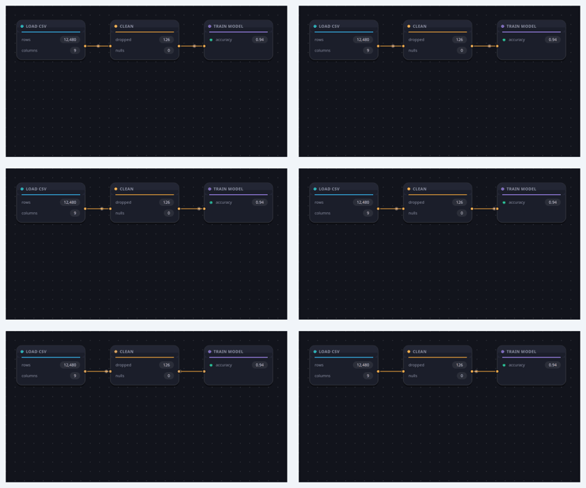
A node-based visual editor canvas.
An infinite, pan/zoom canvas with a dotted-grid backdrop that hosts draggable NODE cards. Each node has a titled header (accent dot), a body of painted content (freeform text, label/value rows, an image thumbnail, or chips) and typed input/output PORTS (the socket dots). Drag from an output port to an input port to wire nodes together with a curved bezier CABLE.
Everything is painted with QPainter (crisp at any zoom, no assets) and every colour is a qproperty, so the whole graph recolours on a theme switch. It is data-driven: build a graph declaratively with addNode()/addEdge() or setGraph({...}); read interaction back through nodeMoved / nodeSelected / connectionMade / nodeClicked / canvasClicked.
This is the headline "flow builder / pipeline / AI graph" surface — the SETTINGS/IDEAS/REFERENCES/AI-MODELS canvas in node-based creative tools.
At a glance
| Tier | Pro |
| Import | from Custom_Widgets.QCustomNodeGraph import QCustomNodeGraph |
| Qt Designer | Yes — drag it from the palette |
Quick start
from Custom_Widgets.QCustomNodeGraph import QCustomNodeGraph

widget = QCustomNodeGraph()
widget.setGraph({"nodes": [
{"nid": "load", "title": "Load CSV", "x": 30, "y": 40, "w": 190,
 "h": 110, "accent": "#38bdf8", "outputs": ["data"],
 "rows": [{"label": "rows", "value": "12,480"},
          {"label": "columns", "value": "9"}]},
{"nid": "clean", "title": "Clean", "x": 290, "y": 40, "w": 190,
 "h": 110, "accent": "#f2a63b", "inputs": ["in"], "outputs": ["out"],
 "rows": [{"label": "dropped", "value": "126"},
          {"label": "nulls", "value": "0"}]},
{"nid": "train", "title": "Train model", "x": 550, "y": 40, "w": 190,
 "h": 110, "accent": "#a78bfa", "inputs": ["x"],
 "rows": [{"label": "accuracy", "value": "0.94", "dot": "#22c55e"}]},
], "edges": [
{"src": "load", "srcPort": 0, "dst": "clean", "dstPort": 0},
{"src": "clean", "srcPort": 0, "dst": "train", "dstPort": 0},
]})
That is the exact code behind the screenshot above.
Dark theme
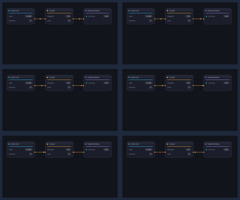
Colours come from the design tokens, so the widget follows the app theme with no extra work.
Properties
Every property below is settable in code and in Qt Designer.
| Property | Type | Default |
|---|---|---|
bgColor | color | #12141c |
gridColor | color | #26ffffff |
gridSpacing | int | 26 |
nodeColor | color | #1b1e2a |
nodeHeaderColor | color | #232634 |
nodeBorderColor | color | #33ffffff |
textColor | color | #e7e9f3 |
mutedColor | color | #8b90a6 |
portColor | color | #f2a63b |
edgeColor | color | #c98a3a |
selectedColor | color | #6c7bff |
cornerRadius | int | 14 |
animated | bool | True |
Signals
| Signal |
|---|
canvasClicked() |
connectionMade(QString,int,QString,int) |
connectionRemoved(QString,int,QString,int) |
editRequested(QString) |
nodeClicked(QString) |
nodeMoved(QString) |
nodeRemoved(QString) |
nodeSelected(QString) |
rowClicked(QString,int) |
Methods
| Method | Description |
|---|---|
addEdge(src, src_port, dst, dst_port, color=None) | Add an edge. |
addNode(title='Node', x=0.0, y=0.0, w=200.0, h=120.0, accent='#f2a63b', text='', rows=None, image='', chips=None, inputs=None, outputs=None, nid=None) | Add a node. |
animated(*args, **kwargs) | Animated. |
bgColor(*args, **kwargs) | Bg color. |
canvasClicked(...) | Canvas clicked. |
clear() | Clear. |
connectionMade(...) | Connection made. |
connectionRemoved(...) | Connection removed. |
contextMenuEvent(e) | Context menu event. |
cornerRadius(*args, **kwargs) | Corner radius. |
disconnectNode(nid) | Remove every cable attached to a node (keeps the node). |
edgeColor(*args, **kwargs) | Edge color. |
editRequested(...) | Edit requested. |
fitToView(margin=40) | Fit the to view. |
gridColor(*args, **kwargs) | Grid color. |
gridSpacing(*args, **kwargs) | Grid spacing. |
mutedColor(*args, **kwargs) | Muted color. |
nodeAccent(nid) | Node accent. |
nodeBorderColor(*args, **kwargs) | Node border color. |
nodeById(nid) | Node by id. |
nodeClicked(...) | Node clicked. |
nodeColor(*args, **kwargs) | Node color. |
nodeHeaderColor(*args, **kwargs) | Node header color. |
nodeMoved(...) | Node moved. |
nodeRemoved(...) | Node removed. |
nodeRows(nid) | Node rows. |
nodeSelected(...) | Node selected. |
nodeText(nid) | Node text. |
nodeTitle(nid) | Node title. |
portColor(*args, **kwargs) | Port color. |
removeEdge(src, src_port, dst, dst_port) | Remove an edge. |
removeEdgeAt(index) | Disconnect (remove) the edge at index. |
removeNode(nid) | Delete a node and every cable attached to it. |
rowClicked(...) | Row clicked. |
selectedColor(*args, **kwargs) | Selected color. |
setGraph(data) | data = {"nodes":[{...}], "edges":[{"src","srcPort","dst","dstPort","color"}]}. |
setNodeAccent(nid, color) | Recolour a node (its header dot + underline, chips, glow). |
setNodePosition(nid, x, y) | Set the node position. |
setNodeText(nid, text) | Set the node text. |
setNodeTitle(nid, title) | Set the node title. |
setRowValue(nid, idx, value) | Set the row value. |
textColor(*args, **kwargs) | Text color. |
Related
QCustomCodeEditor · QCustomDataTable · QCustomRichTextEditor · QCustomTableToolbar · QCustomTreeWidget