QCustomBubbleChart
QCustomBubbleChart ships in Custom Widgets Pro. It is not part of the free GPLv3 package from 2.6.0 onward — the free package keeps the import path so Qt Designer forms still load, and installing Pro activates the widget with no code change. Releases up to 2.5.0 included it under the GPLv3.
Pro is licensed software and is not installable from PyPI — the name there is a pointer package with no widgets in it. Licence holders download the wheel from their account:
# https://portal.customwidgets.org/downloads
pip install <the downloaded .whl>
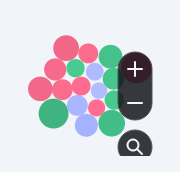
An interactive packed-circle (bubble) chart.
The sentiment / share bubble cloud: one circle per item, AREA proportional to the value, coloured by category and labelled inside when big enough. Circles are packed by a small deterministic force relaxation (push overlaps apart + gravity to a per-category anchor when grouped), then scaled to fill the widget.
INTERACTIVE (the reference has all of these):
- hover -> a CUSTOM painted tooltip card (never the OS QToolTip), plus a grow animation + glow on the hovered bubble.
- zoom -> wheel zooms toward the cursor, a painted +/- control, drag to pan, double-click to reset. zoomIn()/zoomOut()/resetView().
- search -> setSearchQuery(text) dims the non-matching bubbles; the painted search button emits searchRequested().
- scale -> optional category grouping (
groupByCategory) + axis labels.
setItems([{label, value, category}]) / itemsJson; colours via setCategoryColors({category: colour}). Signals: bubbleClicked(label), searchRequested(), zoomChanged(float).
At a glance
| Tier | Pro |
| Import | from Custom_Widgets.QCustomBubbleChart import QCustomBubbleChart |
| Qt Designer | Yes — drag it from the palette |
Quick start
from Custom_Widgets.QCustomBubbleChart import QCustomBubbleChart

widget = QCustomBubbleChart()
Dark theme
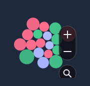
Colours come from the design tokens, so the widget follows the app theme with no extra work.
Properties
Every property below is settable in code and in Qt Designer.
| Property | Type | Default |
|---|---|---|
itemsJson | string | — |
categoriesJson | string | — |
padding | float | 3.0 |
showLabels | bool | True |
minLabelRadius | float | 16.0 |
labelColor | color | #ffffff |
defaultColor | color | #8b90a0 |
shadeVariation | float | 0.18 |
hoverGlow | bool | True |
hoverScale | float | 1.16 |
groupByCategory | bool | False |
zoomable | bool | True |
showControls | bool | True |
searchQuery | string | — |
tooltips | bool | True |
tooltipBgColor | color | #0e1016 |
controlColor | color | #f4f6fb |
Signals
| Signal |
|---|
bubbleClicked(QString) |
searchRequested() |
zoomChanged(double) |
Methods
| Method | Description |
|---|---|
bubbleClicked(...) | Bubble clicked. |
categoriesJson(*args, **kwargs) | Categories json. |
controlColor(*args, **kwargs) | Control color. |
defaultColor(*args, **kwargs) | Default color. |
groupByCategory(*args, **kwargs) | Group by category. |
hoverGlow(*args, **kwargs) | Hover glow. |
hoverScale(*args, **kwargs) | Hover scale. |
items() | Items. |
itemsJson(*args, **kwargs) | Items json. |
labelColor(*args, **kwargs) | Label color. |
minLabelRadius(*args, **kwargs) | Min label radius. |
padding(*args, **kwargs) | Padding. |
resetView() | Reset the view. |
searchQuery(*args, **kwargs) | Search query. |
searchRequested(...) | Search requested. |
setCategoryColors(mapping) | Set the category colors. |
setItems(items) | Set the items. |
setSearchQuery(text) | Set the search query. |
shadeVariation(*args, **kwargs) | Shade variation. |
showControls(*args, **kwargs) | Show the controls. |
showLabels(*args, **kwargs) | Show the labels. |
tooltipBgColor(*args, **kwargs) | Tooltip bg color. |
tooltips(*args, **kwargs) | Tooltips. |
zoomChanged(...) | Zoom changed. |
zoomIn() | Zoom in. |
zoomOut() | Zoom out. |
zoomable(*args, **kwargs) | Zoomable. |
Related
QCustomAreaChart · QCustomBarChart · QCustomBeeswarm · QCustomCandlestickChart · QCustomCompass · QCustomCompassDial · QCustomDivergingBarChart · QCustomDonut