QCustomMiniBarChart
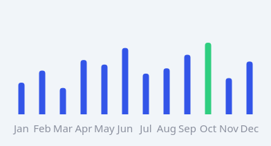
A compact, axis-less bar chart.
The painted sibling of QCustomSparkline: a row of bottom-aligned bars with rounded tops, PER-BAR colours, an optional highlighted bar, and optional labels underneath (e.g. day numbers). Unlike the QtCharts QCustomBarChart it carries no axes/grid/legend/toolbar and stays crisp at any size - perfect for a dashboard panel where each bar wants its own colour (idle / accent / a single highlighted value). Give data via setData([...]) in code, or the valuesCsv / colorsCsv / labelsCsv properties in Qt Designer.
At a glance
| Tier | Free (GPLv3) |
| Import | from Custom_Widgets.QCustomMiniBarChart import QCustomMiniBarChart |
| Qt Designer | Yes — drag it from the palette |
Quick start
from Custom_Widgets.QCustomMiniBarChart import QCustomMiniBarChart

widget = QCustomMiniBarChart()
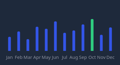
Dark theme
Colours come from the design tokens, so the widget follows the app theme with no extra work.
Properties
Every property below is settable in code and in Qt Designer.
| Property | Type | Default |
|---|---|---|
valuesCsv | string | 6,12,10,7,14,18,7,13,19,22,14 |
colorsCsv | string | — |
labelsCsv | string | — |
barColor | color | #3355e8 |
idleColor | color | #d7dbe6 |
highlightColor | color | #2fce80 |
highlightIndexProp | int | — |
barWidth | int | 9 |
cornerRadius | int | 4 |
showLabels | bool | True |
labelColor | color | — |
calloutText | string | — |
calloutBg | color | #ffffff |
calloutTextColor | color | #1a1e2c |
yLabelsCsv | string | — |
yLabelColor | color | #8b909e |
hoverEnabled | bool | True |
hoverSuffix | string | — |
selectOnClick | bool | False |
Signals
| Signal |
|---|
barClicked(int) |
barHovered(int) |
Methods
| Method | Description |
|---|---|
barClicked(...) | Bar clicked. |
barColor(*args, **kwargs) | Bar color. |
barHovered(...) | Bar hovered. |
barWidth(*args, **kwargs) | Bar width. |
calloutBg(*args, **kwargs) | Callout bg. |
calloutText(*args, **kwargs) | Callout text. |
calloutTextColor(*args, **kwargs) | Callout text color. |
clearHighlight() | Clear the highlight. |
colorsCsv(*args, **kwargs) | Colors csv. |
cornerRadius(*args, **kwargs) | Corner radius. |
highlightColor(*args, **kwargs) | Highlight color. |
highlightIndex(index, color=None) | Highlight a single bar (in highlightColor, or the given colour). |
highlightIndexProp(*args, **kwargs) | Highlight index prop. |
hoverEnabled(*args, **kwargs) | Hover enabled. |
hoverSuffix(*args, **kwargs) | Unit appended to the hover bubble's value, e.g. ' kWh'. |
idleColor(*args, **kwargs) | Idle color. |
labelColor(*args, **kwargs) | Label color. |
labelsCsv(*args, **kwargs) | Labels csv. |
selectOnClick(*args, **kwargs) | When true, clicking a bar moves the highlight (and the callout, if |
setBarColors(colors) | Give each bar its own colour (list parallel to values). |
setData(values, colors=None, labels=None) | Set the data. |
setIdleThreshold(value) | Bars whose value is <= value paint in idleColor (e.g. weekends). |
setLabels(labels) | Set the labels. |
setValues(values) | Set the values. |
showLabels(*args, **kwargs) | Show the labels. |
values() | Values. |
valuesCsv(*args, **kwargs) | Values csv. |
yLabelColor(*args, **kwargs) | Y label color. |
yLabelsCsv(*args, **kwargs) | Y labels csv. |
Related
QCustomAreaChart · QCustomBarChart · QCustomBeeswarm · QCustomBubbleChart · QCustomCandlestickChart · QCustomCompass · QCustomCompassDial · QCustomDivergingBarChart