QCustomDivergingBarChart
QCustomDivergingBarChart ships in Custom Widgets Pro. It is not part of the free GPLv3 package from 2.6.0 onward — the free package keeps the import path so Qt Designer forms still load, and installing Pro activates the widget with no code change. Releases up to 2.5.0 included it under the GPLv3.
Pro is licensed software and is not installable from PyPI — the name there is a pointer package with no widgets in it. Licence holders download the wheel from their account:
# https://portal.customwidgets.org/downloads
pip install <the downloaded .whl>
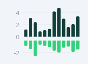
A diverging (bipolar / up-down) bar chart.
Each category is ONE column split across a zero axis: an UPWARD segment
(e.g. income, upColor) and a DOWNWARD segment (e.g. expense/expenditure,
downColor), so a single slot carries two colours and two signs. A
configurable zeroGap leaves clear space between the + and - bars around
the zero line (as in cash-flow dashboards). Painted (no QtCharts) so it is
crisp at any size and needs no toolbar/legend.
This is the diverging sibling of QCustomMiniBarChart. Give data via setData(up, down, labels) in code, or the upCsv / downCsv / labelsCsv properties in Qt Designer. Optional y-axis (gridlines + prefixed/suffixed value labels, e.g. "EUR 5K") and x labels underneath.
At a glance
| Tier | Pro |
| Import | from Custom_Widgets.QCustomDivergingBarChart import QCustomDivergingBarChart |
| Qt Designer | Yes — drag it from the palette |
Quick start
from Custom_Widgets.QCustomDivergingBarChart import QCustomDivergingBarChart

widget = QCustomDivergingBarChart()
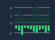
Dark theme
Colours come from the design tokens, so the widget follows the app theme with no extra work.
Properties
Every property below is settable in code and in Qt Designer.
| Property | Type | Default |
|---|---|---|
upCsv | string | 1.2,3.1,2.4,0.9,1.1,4.2,3.0,2.0 |
downCsv | string | 0.9,1.4,2.6,0.7,0.9,1.7,1.2,1.3 |
labelsCsv | string | — |
upColor | color | #123f39 |
downColor | color | #34d17a |
barWidth | int | 12 |
cornerRadius | int | 3 |
zeroGap | int | 8 |
showAxis | bool | True |
showLabels | bool | True |
axisPrefix | string | — |
axisSuffix | string | — |
gridColor | color | #e6e9ec |
axisTextColor | color | #8b93a1 |
Methods
| Method | Description |
|---|---|
axisPrefix(*args, **kwargs) | Axis prefix. |
axisSuffix(*args, **kwargs) | Axis suffix. |
axisTextColor(*args, **kwargs) | Axis text color. |
barWidth(*args, **kwargs) | Bar width. |
cornerRadius(*args, **kwargs) | Corner radius. |
downColor(*args, **kwargs) | Down color. |
downCsv(*args, **kwargs) | Down csv. |
downValues() | Down values. |
gridColor(*args, **kwargs) | Grid color. |
labelsCsv(*args, **kwargs) | Labels csv. |
setColors(up_color, down_color) | Set the colors. |
setData(up, down, labels=None) | Set both series at once. up = upward (income) values, down = |
setDownValues(values) | Set the down values. |
setLabels(labels) | Set the labels. |
setTickStep(step) | Axis gridline/label step in data units (0 = auto). |
setUpValues(values) | Set the up values. |
showAxis(*args, **kwargs) | Show the axis. |
showLabels(*args, **kwargs) | Show the labels. |
upColor(*args, **kwargs) | Up color. |
upCsv(*args, **kwargs) | Up csv. |
upValues() | Up values. |
zeroGap(*args, **kwargs) | Zero gap. |
Related
QCustomAreaChart · QCustomBarChart · QCustomBeeswarm · QCustomBubbleChart · QCustomCandlestickChart · QCustomCompass · QCustomCompassDial · QCustomDonut