QCustomAccordion
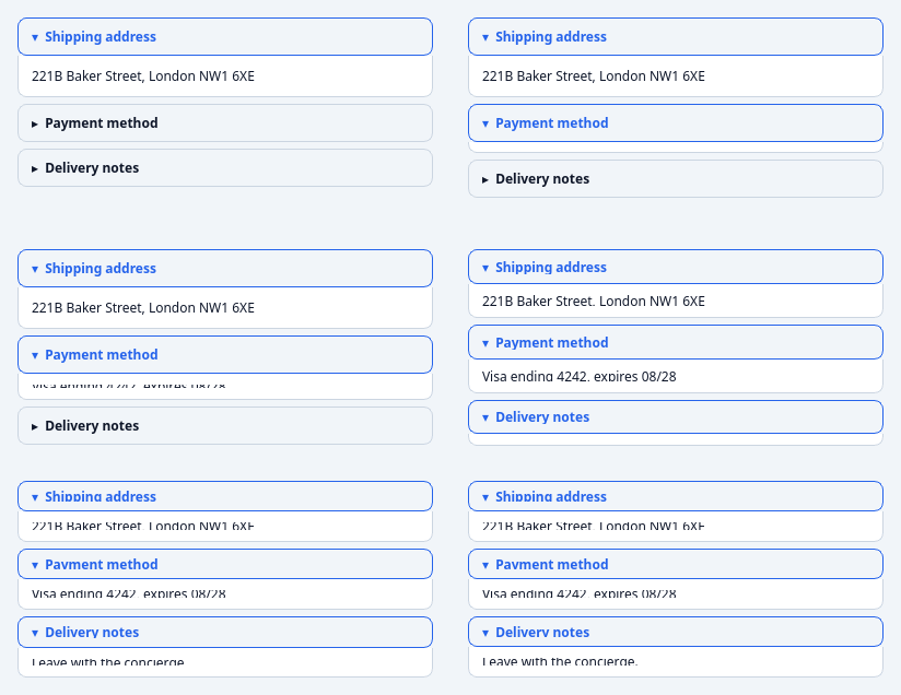
A stack of collapsible sections.
Each section is a header button + an animated collapsible content area. Optional exclusive mode (only one section open at a time). Tokenized.
At a glance
| Tier | Free (GPLv3) |
| Import | from Custom_Widgets.QCustomAccordion import QCustomAccordion |
| Qt Designer | Yes — drag it from the palette |
Quick start
from Custom_Widgets.QCustomAccordion import QCustomAccordion

widget = QCustomAccordion()
widget.addSection("Shipping address", QLabel("221B Baker Street, London NW1 6XE"))
widget.addSection("Payment method", QLabel("Visa ending 4242, expires 08/28"))
widget.addSection("Delivery notes", QLabel("Leave with the concierge."))
widget.setExpanded(0, True, animate=False)   # no-op unless the section exists
That is the exact code behind the screenshot above.
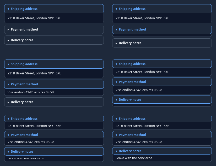
Dark theme
Colours come from the design tokens, so the widget follows the app theme with no extra work.
Properties
Every property below is settable in code and in Qt Designer.
| Property | Type | Default |
|---|---|---|
exclusive | bool | False |
Signals
| Signal |
|---|
sectionToggled(int,bool) |
Methods
| Method | Description |
|---|---|
addSection(title, content) | Add a section. |
exclusive(*args, **kwargs) | Exclusive. |
expandedIndices() | Expanded indices. |
isExclusive() | Return whether the widget is exclusive. |
section(index) | Section. |
sectionCount() | Section count. |
sectionToggled(...) | Section toggled. |
setExclusive(exclusive) | Set the exclusive. |
setExpanded(index, expanded, animate=True) | Set the expanded. |
Theming
Colours come from the design tokens, so they follow the active theme. Roles used: surface, on-surface, surface-muted, outline, accent.
See Design tokens.
Related
QCustomCardStack · QCustomCarousel · QCustomComponent · QCustomComponentContainer · QCustomComponentLoader · QCustomEmbeddedWindow · QCustomFlowLayout · QCustomFlowWidget