QCustomCoverCard
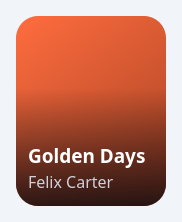
An album / song COVER card.
A rounded album-art tile: the cover image fills a rounded rectangle
(centre-cropped, KeepAspectRatioByExpanding), a bottom gradient SCRIM
darkens the lower third, and a bold TITLE over a muted ARTIST sit at the
bottom-left. A translucent circular PLAY badge fades in on hover (or is
pinned on with showPlay). Everything is painted with QPainter so it stays
crisp at any size and recolours on a theme switch (all colours are
qproperties). When no coverPath is set it paints a two-stop gradient from
accentColor so it still previews in Designer / render_widget.
It is a QAbstractButton, so it emits clicked() — drop it in a "Popular
songs" / "Recently played" row or a coverflow. Give it title, artist
and coverPath in code or Qt Designer.
At a glance
| Tier | Free (GPLv3) |
| Import | from Custom_Widgets.QCustomCoverCard import QCustomCoverCard |
| Qt Designer | Yes — drag it from the palette |
Quick start
from Custom_Widgets.QCustomCoverCard import QCustomCoverCard

widget = QCustomCoverCard()
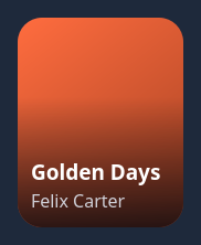
Dark theme
Colours come from the design tokens, so the widget follows the app theme with no extra work.
Properties
Every property below is settable in code and in Qt Designer.
| Property | Type | Default |
|---|---|---|
text | string | — |
icon | QIcon | — |
iconSize | QSize | — |
shortcut | QKeySequence | — |
checkable | bool | — |
checked | bool | — |
autoRepeat | bool | — |
autoExclusive | bool | — |
autoRepeatDelay | int | — |
autoRepeatInterval | int | — |
down | bool | — |
title | string | Golden Days |
artist | string | Felix Carter |
coverPath | string | — |
accentColor | color | #e0592f |
titleColor | color | #ffffff |
artistColor | color | #d0d0d8 |
cornerRadius | int | 22 |
scrimStrength | float | 0.85 |
scrimColor | color | #06080e |
showPlay | bool | False |
playOnHover | bool | True |
titleScale | float | 1.0 |
textAlign | enum: left/center`` | left |
Signals
| Signal |
|---|
playClicked() |
Methods
| Method | Description |
|---|---|
accentColor(*args, **kwargs) | Accent color. |
artist(*args, **kwargs) | Artist. |
artistColor(*args, **kwargs) | Artist color. |
cornerRadius(*args, **kwargs) | Corner radius. |
coverPath(*args, **kwargs) | Cover path. |
playClicked(...) | Play clicked. |
playOnHover(*args, **kwargs) | Play on hover. |
scrimColor(*args, **kwargs) | Scrim color. |
scrimStrength(*args, **kwargs) | Scrim strength. |
setArtist(text) | Set the artist. |
setCoverPath(path) | Set the cover path. |
setData(title=None, artist=None, coverPath=None) | Set the data. |
setTitle(text) | Set the title. |
showPlay(*args, **kwargs) | Show the play. |
textAlign(*args, **kwargs) | Text align. |
title(*args, **kwargs) | Title. |
titleColor(*args, **kwargs) | Title color. |
titleScale(*args, **kwargs) | Title scale. |
Related
QCustomAgendaList · QCustomAlert · QCustomAvatar · QCustomAvatarGroup · QCustomBadge · QCustomCard · QCustomChip · QCustomChipGroup