QCustomTabWidget
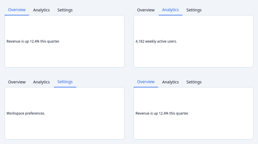
A tokenized tab container.
Built on QTabWidget (correct tab management + keyboard) with three
token-styled looks via the tabStyle property: "underline" (default),
"pills", "enclosed". Density follows sizeVariant.
At a glance
| Tier | Free (GPLv3) |
| Import | from Custom_Widgets.QCustomTabWidget import QCustomTabWidget |
| Qt Designer | Yes — drag it from the palette |
Quick start
from Custom_Widgets.QCustomTabWidget import QCustomTabWidget

widget = QCustomTabWidget()
widget.addTab(QLabel("  Revenue is up 12.4% this quarter."), "Overview")
widget.addTab(QLabel("  4,182 weekly active users."), "Analytics")
widget.addTab(QLabel("  Workspace preferences."), "Settings")
widget.tabStyle = "underline"
That is the exact code behind the screenshot above.
Dark theme
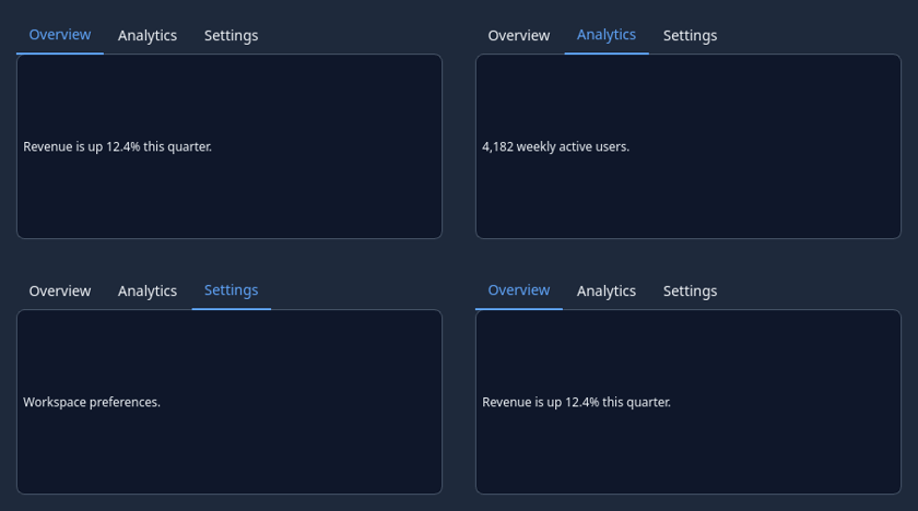
Colours come from the design tokens, so the widget follows the app theme with no extra work.
Properties
Every property below is settable in code and in Qt Designer.
| Property | Type | Default |
|---|---|---|
tabPosition | QTabWidget::TabPosition | — |
tabShape | QTabWidget::TabShape | — |
currentIndex | int | — |
count | int | — |
iconSize | QSize | — |
elideMode | Qt::TextElideMode | — |
usesScrollButtons | bool | — |
documentMode | bool | — |
tabsClosable | bool | — |
movable | bool | — |
tabBarAutoHide | bool | — |
closableTabs | bool | False |
showAddButton | bool | False |
tabStyle | enum: underline/pills/enclosed`` | underline |
sizeVariant | enum: sm/md/lg`` | md |
Signals
| Signal |
|---|
addTabRequested() |
Methods
| Method | Description |
|---|---|
addTabRequested(...) | Add a tab requested. |
closableTabs(*args, **kwargs) | Closable tabs. |
showAddButton(*args, **kwargs) | Show the add button. |
sizeVariant(*args, **kwargs) | Size variant. |
tabStyle(*args, **kwargs) | Tab style. |
Theming
Colours come from the design tokens, so they follow the active theme. Roles used: surface, on-surface, outline, accent, on-primary.
See Design tokens.
Related
QCustomBreadcrumbs · QCustomCommandPalette · QCustomDrawer · QCustomHamburgerMenu · QCustomHeaderNav · QCustomMenu · QCustomPagination · QCustomSidebar