QCustomCoverFlow
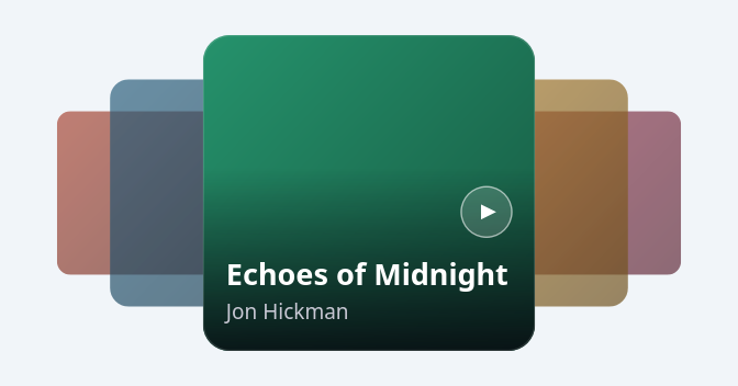
A 3D COVER-FLOW carousel.
The signature music/media hero: the ACTIVE cover sits large and centred
with a bottom scrim, TITLE + ARTIST and a circular PLAY badge; its
neighbours PEEK out on either side, progressively SCALED DOWN, DIMMED and
slid behind it to fake depth. Click a side cover (or drag / wheel / arrow
keys) to rotate it to the centre — the motion EASES smoothly. Fully
painted with QPainter so it is crisp at any size and needs no images to
preview (covers with no coverPath fall back to a per-item accent
gradient).
Data-driven: feed it items with setItems([...]) (each: title, artist,
coverPath, accent) or the itemsJson Designer property. Emits
currentChanged(int), itemClicked(int) and playClicked(int).
At a glance
| Tier | Free (GPLv3) |
| Import | from Custom_Widgets.QCustomCoverFlow import QCustomCoverFlow |
| Qt Designer | Yes — drag it from the palette |
Quick start
from Custom_Widgets.QCustomCoverFlow import QCustomCoverFlow

widget = QCustomCoverFlow()
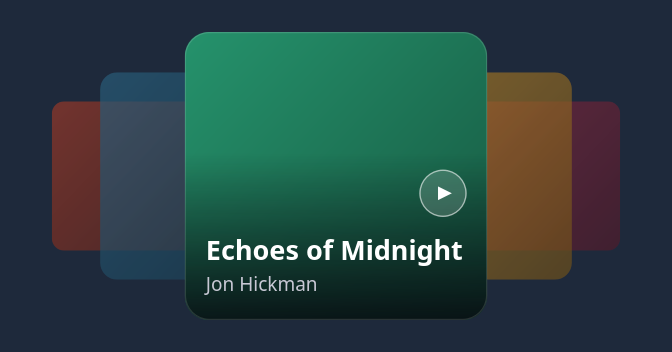
Dark theme
Colours come from the design tokens, so the widget follows the app theme with no extra work.
Properties
Every property below is settable in code and in Qt Designer.
| Property | Type | Default |
|---|---|---|
itemsJson | string | [] |
currentIndex | int | 0 |
activeRatio | float | 0.9 |
aspect | float | 1.05 |
sideScale | float | 0.72 |
sideOpacity | float | 0.55 |
sideSpacing | float | 0.42 |
cornerRadius | int | 24 |
showText | bool | True |
showPlay | bool | True |
titleColor | color | #ffffff |
artistColor | color | #c8c8d4 |
playColor | color | #ffffff |
Signals
| Signal |
|---|
currentChanged(int) |
itemClicked(int) |
playClicked(int) |
Methods
| Method | Description |
|---|---|
activeRatio(*args, **kwargs) | Active ratio. |
artistColor(*args, **kwargs) | Artist color. |
aspect(*args, **kwargs) | Aspect. |
cornerRadius(*args, **kwargs) | Corner radius. |
count() | Count. |
currentChanged(...) | Current changed. |
currentIndex(*args, **kwargs) | Current index. |
itemClicked(...) | Item clicked. |
itemsJson(*args, **kwargs) | Items json. |
next() | Next. |
playClicked(...) | Play clicked. |
playColor(*args, **kwargs) | Play color. |
previous() | Previous. |
setCurrentIndex(i, animate=True) | Set the current index. |
setItems(items) | Set the items. |
showPlay(*args, **kwargs) | Show the play. |
showText(*args, **kwargs) | Show the text. |
sideOpacity(*args, **kwargs) | Side opacity. |
sideScale(*args, **kwargs) | Side scale. |
sideSpacing(*args, **kwargs) | Side spacing. |
titleColor(*args, **kwargs) | Title color. |
Related
QCustomImageViewer · QCustomMediaGrid · QCustomMediaTimeline · QCustomPlayerBar · QCustomVideoPlayer · QCustomVoiceMessage · QCustomWallpaper