QCustomVoiceMessage
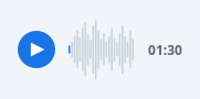
A voice / audio message with a scrubber waveform.
The audio row seen inside a chat bubble: a circular play / pause button, a
painted bar waveform (heights from valuesCsv), and a duration label. The
played portion of the waveform fills with the accent colour up to
progress (0..1), the rest stays muted, so it doubles as a scrubber. Bars
are painted (crisp at any size, no assets); every colour is a qproperty so
it tracks the theme. Clicking the button toggles playing and emits
playToggled(bool); clicking the waveform emits seeked(float).
At a glance
| Tier | Free (GPLv3) |
| Import | from Custom_Widgets.QCustomVoiceMessage import QCustomVoiceMessage |
| Qt Designer | Yes — drag it from the palette |
Quick start
from Custom_Widgets.QCustomVoiceMessage import QCustomVoiceMessage

widget = QCustomVoiceMessage()
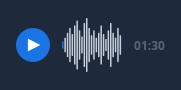
Dark theme
Colours come from the design tokens, so the widget follows the app theme with no extra work.
Properties
Every property below is settable in code and in Qt Designer.
| Property | Type | Default |
|---|---|---|
valuesCsv | string | 3,6,10,14,9,16,20,12,7,18,22,14,8,12,6,10,16,9,5,12,18,10,6,14,8 |
duration | string | 01:30 |
progress | float | 0.0 |
playing | bool | False |
playedColor | color | #1b74e4 |
unplayedColor | color | #c7d0dc |
buttonColor | color | #1b74e4 |
buttonIconColor | color | #ffffff |
durationColor | color | #5a6478 |
buttonDiameter | int | 34 |
Signals
| Signal |
|---|
playToggled(bool) |
seeked(double) |
Methods
| Method | Description |
|---|---|
buttonColor(*args, **kwargs) | Button color. |
buttonDiameter(*args, **kwargs) | Button diameter. |
buttonIconColor(*args, **kwargs) | Button icon color. |
duration(*args, **kwargs) | Duration. |
durationColor(*args, **kwargs) | Duration color. |
playToggled(...) | Play toggled. |
playedColor(*args, **kwargs) | Played color. |
playing(*args, **kwargs) | Playing. |
progress(*args, **kwargs) | Progress. |
seeked(...) | Seeked. |
unplayedColor(*args, **kwargs) | Unplayed color. |
valuesCsv(*args, **kwargs) | Values csv. |
Related
QCustomCoverFlow · QCustomImageViewer · QCustomMediaGrid · QCustomMediaTimeline · QCustomPlayerBar · QCustomVideoPlayer · QCustomWallpaper