QCustomActionButton
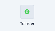
A round icon button with a caption beneath it.
The "quick action" tile seen on profile panels and toolbars (Profile / Mute /
Search, Call / Video, …): a circular icon button over a small caption label.
The icon is a normal Qt icon so it can be set in Designer OR from QSS
(#objectName { qproperty-icon: url(theme-icons:…) }) and recolours with the
theme; colours are qproperties. Emits clicked. Designer-droppable, so a
row of these is assembled in the form, not hand-built in Python.
At a glance
| Tier | Free (GPLv3) |
| Import | from Custom_Widgets.QCustomActionButton import QCustomActionButton |
| Qt Designer | Yes — drag it from the palette |
Quick start
from Custom_Widgets.QCustomActionButton import QCustomActionButton

widget = QCustomActionButton()
widget.icon = QIcon(_iconPath("paid.png"))
widget.caption = "Transfer"
That is the exact code behind the screenshot above.
Dark theme
Colours come from the design tokens, so the widget follows the app theme with no extra work.
Properties
Every property below is settable in code and in Qt Designer.
| Property | Type | Default |
|---|---|---|
frameShape | QFrame::Shape | — |
frameShadow | QFrame::Shadow | — |
lineWidth | int | — |
midLineWidth | int | — |
frameWidth | int | — |
frameRect | QRect | — |
caption | string | Profile |
icon | QIcon | — |
buttonSize | int | 46 |
iconSize | int | 19 |
bgColor | color | #f0f2f6 |
hoverColor | color | #1b74e4 |
captionColor | color | #8a93a6 |
Signals
| Signal |
|---|
clicked() |
Methods
| Method | Description |
|---|---|
bgColor(*args, **kwargs) | Bg color. |
buttonSize(*args, **kwargs) | Button size. |
caption(*args, **kwargs) | Caption. |
captionColor(*args, **kwargs) | Caption color. |
clicked(...) | Clicked. |
hoverColor(*args, **kwargs) | Hover color. |
icon(*args, **kwargs) | Icon. |
iconSize(*args, **kwargs) | Icon size. |
Related
QCustomCopyButton · QCustomQPushButton · QCustomQPushButtonGroup · QCustomRainbowButton · QCustomSocialButton · QCustomThemeDarkLightToggle · QCustomTileButton