QCustomCopyButton
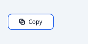
Copy-to-clipboard with confirmation.
The small button beside a code block, an API key or a share link. The whole value of the control is the FEEDBACK: a copy that gives no acknowledgement leaves the user pressing it again to be sure, so this flips to a "Copied!" state and returns on a timer.
Painted so the confirmation can morph rather than swapping stylesheets, and so the tick is drawn rather than being a unicode glyph (the design lint rejects glyph icons).
Emits copied(str) with the text that was placed on the clipboard.
At a glance
| Tier | Free (GPLv3) |
| Import | from Custom_Widgets.QCustomCopyButton import QCustomCopyButton |
| Qt Designer | Yes — drag it from the palette |
Quick start
from Custom_Widgets.QCustomCopyButton import QCustomCopyButton

widget = QCustomCopyButton()
Dark theme
Colours come from the design tokens, so the widget follows the app theme with no extra work.

Properties
Every property below is settable in code and in Qt Designer.
| Property | Type | Default |
|---|---|---|
payload | string | — |
text | string | Copy |
copiedText | string | Copied! |
resetDelay | int | 1600 |
variant | enum: outline/ghost/solid`` | outline |
iconOnly | bool | False |
accentColor | color | #2563eb |
successColor | color | #16a34a |
textColor | color | #0f172a |
surfaceColor | color | #ffffff |
Signals
| Signal |
|---|
copied(QString) |
Methods
| Method | Description |
|---|---|
accentColor(*args, **kwargs) | Accent color. |
copied(...) | Copied. |
copiedText(*args, **kwargs) | Copied text. |
copy() | Put the payload on the clipboard and confirm. False if empty. |
iconOnly(*args, **kwargs) | Icon only. |
isConfirming() | Return whether the widget is confirming. |
payload(*args, **kwargs) | Payload. |
resetDelay(*args, **kwargs) | Reset the delay. |
successColor(*args, **kwargs) | Success color. |
surfaceColor(*args, **kwargs) | Surface color. |
text(*args, **kwargs) | Text. |
textColor(*args, **kwargs) | Text color. |
variant(*args, **kwargs) | Variant. |
Theming
Colours come from the design tokens, so they follow the active theme. Roles used: accent, on-surface, success, surface.
See Design tokens.
Runnable example
A complete app using this widget lives at examples/PySide6/QCustomCopyButton/main.py.
Related
QCustomActionButton · QCustomQPushButton · QCustomQPushButtonGroup · QCustomRainbowButton · QCustomSocialButton · QCustomThemeDarkLightToggle · QCustomTileButton