QCustomRainbowButton
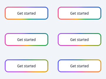
A button with an animated conic border.
The "shiny" call-to-action: a colour wheel rotating around the rim. QSS cannot animate a gradient, so the border is painted and the rotation driven by a timer.
The animation stops when the widget is hidden. A permanently repainting button on an invisible page is pure battery drain, and it is the kind of thing nobody notices until a laptop fan tells them.
Emits clicked().
At a glance
| Tier | Free (GPLv3) |
| Import | from Custom_Widgets.QCustomRainbowButton import QCustomRainbowButton |
| Qt Designer | Yes — drag it from the palette |
Quick start
from Custom_Widgets.QCustomRainbowButton import QCustomRainbowButton

widget = QCustomRainbowButton()
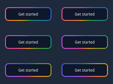
Dark theme
Colours come from the design tokens, so the widget follows the app theme with no extra work.
Properties
Every property below is settable in code and in Qt Designer.
| Property | Type | Default |
|---|---|---|
text | string | Get started |
colorsCsv | string | #2563eb,#a855f7,#ec4899,#f59e0b,#16a34a,#2563eb |
borderWidth | int | 3 |
cornerRadius | int | 10 |
speed | int | 40 |
animated | bool | True |
glow | bool | False |
filled | bool | False |
sizeVariant | enum: sm/md/lg`` | md |
textColor | color | #0f172a |
surfaceColor | color | #ffffff |
Signals
| Signal |
|---|
clicked() |
Methods
| Method | Description |
|---|---|
animated(*args, **kwargs) | Animated. |
borderWidth(*args, **kwargs) | Border width. |
clicked(...) | Clicked. |
colors() | Colors. |
colorsCsv(*args, **kwargs) | Colors csv. |
cornerRadius(*args, **kwargs) | Corner radius. |
filled(*args, **kwargs) | Filled. |
glow(*args, **kwargs) | Glow. |
isAnimating() | Return whether the widget is animating. |
setColors(colors) | Replace the wheel. Fewer than two valid colours is rejected. |
sizeVariant(*args, **kwargs) | Size variant. |
speed(*args, **kwargs) | Speed. |
start() | Start. |
stop() | Stop. |
surfaceColor(*args, **kwargs) | Surface color. |
text(*args, **kwargs) | Text. |
textColor(*args, **kwargs) | Text color. |
Theming
Colours come from the design tokens, so they follow the active theme. Roles used: surface, on-surface.
See Design tokens.
Runnable example
A complete app using this widget lives at examples/PySide6/QCustomRainbowButton/main.py.
Related
QCustomActionButton · QCustomCopyButton · QCustomQPushButton · QCustomQPushButtonGroup · QCustomSocialButton · QCustomThemeDarkLightToggle · QCustomTileButton