QCustomButtonGroup
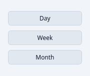
An accessible button group (radio-style or checkbox-style selection).
Wraps QButtonGroup with a tokenized, variant-aware presentation:
- variant: "primary" | "secondary" | "outline" (default)
- sizeVariant: "sm" | "md" (default) | "lg"
- exclusive: True (radio) or False (checkbox)
- orientation: "horizontal" | "vertical" (default)
Each button carries the same variant/size as the group, with a "selected" state that's driven by the button group's selection.
At a glance
| Tier | Free (GPLv3) |
| Import | from Custom_Widgets.QCustomButtonGroup import QCustomButtonGroup |
| Qt Designer | Yes — drag it from the palette |
Quick start
from Custom_Widgets.QCustomButtonGroup import QCustomButtonGroup

widget = QCustomButtonGroup()
widget.setButtons([("Day", 0), ("Week", 1), ("Month", 2)])
widget.setSelectedId(1)
That is the exact code behind the screenshot above.
Dark theme
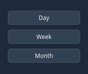
Colours come from the design tokens, so the widget follows the app theme with no extra work.
Properties
Every property below is settable in code and in Qt Designer.
| Property | Type | Default |
|---|---|---|
variant | enum: primary/secondary/outline`` | outline |
sizeVariant | enum: sm/md/lg`` | md |
exclusive | bool | True |
orientation | enum: horizontal/vertical`` | vertical |
Signals
| Signal |
|---|
selectionChanged(int,QString) |
Methods
| Method | Description |
|---|---|
addButton(text, button_id=None) | Add a button to the group. |
exclusive(*args, **kwargs) | Exclusive. |
orientation(*args, **kwargs) | Orientation. |
selectedId() | Return the ID of the selected button, or -1 if none. |
selectedText() | Return the text of the selected button, or empty string if none. |
selectionChanged(...) | Selection changed. |
setButtons(items) | Replace all buttons. Items may be strings or (text, id) pairs. |
setSelectedId(button_id) | Set the selected button by ID. |
sizeVariant(*args, **kwargs) | Size variant. |
variant(*args, **kwargs) | Variant. |
Related
QCustomCheckBox · QCustomColorPicker · QCustomComboBox · QCustomDateEdit · QCustomDateRangeEdit · QCustomDateRangePicker · QCustomEmojiPicker · QCustomFileDropZone