QCustomSegmentedControl
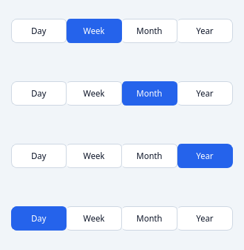
A single-select connected button group.
A row of joined segments; exactly one is selected. Tokenized, with rounded
ends via a seg position property (first / middle / last / only). Emits
currentChanged.
At a glance
| Tier | Free (GPLv3) |
| Import | from Custom_Widgets.QCustomSegmentedControl import QCustomSegmentedControl |
| Qt Designer | Yes — drag it from the palette |
Quick start
from Custom_Widgets.QCustomSegmentedControl import QCustomSegmentedControl

widget = QCustomSegmentedControl()
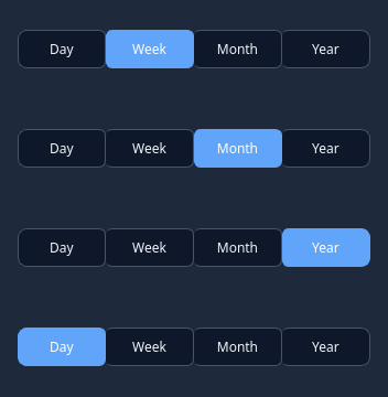
Dark theme
Colours come from the design tokens, so the widget follows the app theme with no extra work.
Properties
Every property below is settable in code and in Qt Designer.
| Property | Type | Default |
|---|---|---|
segments | string | — |
currentSegment | int | — |
Signals
| Signal |
|---|
currentChanged(int) |
Methods
| Method | Description |
|---|---|
count() | Count. |
currentChanged(...) | Current changed. |
currentData() | Current data. |
currentIndex() | Current index. |
currentSegment(*args, **kwargs) | currentIndex as a settable Designer property (avoids clashing with |
segments(*args, **kwargs) | Comma-separated segment labels — set the tabs from Designer. |
setCurrentIndex(index) | Set the current index. |
setItems(items) | Each item is a string, (label, data) pair, or a dict with |
setSegments(items) | Each item is a string, (label, data) pair, or a dict with |
Theming
Colours come from the design tokens, so they follow the active theme. Roles used: surface, on-surface, surface-muted, outline, accent, on-primary.
See Design tokens.
Related
QCustomButtonGroup · QCustomCheckBox · QCustomColorPicker · QCustomComboBox · QCustomDateEdit · QCustomDateRangeEdit · QCustomDateRangePicker · QCustomEmojiPicker