AnalogGaugeWidget
AnalogGaugeWidget is a highly customizable analog gauge meter widget that provides a visually appealing way to display numerical values with analog-style indicators. It features multiple themes, smooth animations, and extensive customization options.
Overview
-
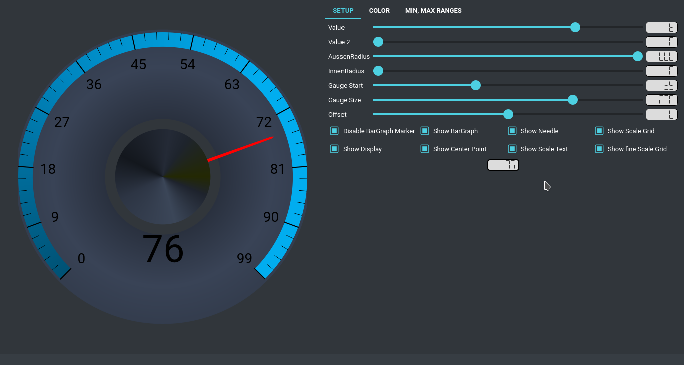
Analog Display:
Classic analog gauge with needle pointer for intuitive value representation. -
Multiple Themes:
Includes 11 preset themes with customizable color schemes. -
Smooth Animations:
Fluid needle movement with drag interaction support. -
Customizable Scales:
Configurable scale ranges, divisions, and appearance. -
Theme Integration:
Seamlessly integrates with the custom widgets theming system. -
Interactive Controls:
Supports mouse interaction for value adjustment.
Constructor
AnalogGaugeWidget(parent=None, min_value=0, max_value=1000,
                 needle_color=QColor(0, 0, 0, 255),
                 needle_color_drag=QColor(255, 0, 0, 255),
                 scale_value_color=QColor(0, 0, 0, 255),
                 display_value_color=QColor(0, 0, 0, 255),
                 center_point_color=QColor(0, 0, 0, 255))
-
parent:
The parent widget (defaults toNone). -
min_value:
Minimum value displayed on the gauge (default: 0). -
max_value:
Maximum value displayed on the gauge (default: 1000). -
needle_color:
Color of the gauge needle in normal state. -
needle_color_drag:
Color of the gauge needle during drag interaction. -
scale_value_color:
Color of the scale numbers and markers. -
display_value_color:
Color of the central value display. -
center_point_color:
Color of the center pivot point.
Key Properties
themeNumber (int)
-
Purpose:
Selects the preset gauge theme (0-10). -
Getter:
Returns the current theme number. -
Setter:
Applies the specified theme and updates display. -
Example:
gauge.themeNumber = 5
units (str)
-
Purpose:
Units label displayed below the value. -
Getter:
Returns the current units string. -
Setter:
Updates the units label. -
Example:
gauge.units = "km/h"
value (int)
-
Purpose:
Current value displayed by the gauge needle. -
Getter:
Returns the current gauge value. -
Setter:
Updates the value and moves the needle. -
Example:
gauge.value = 75
minValue (int)
-
Purpose:
Minimum value of the gauge scale. -
Getter:
Returns the minimum scale value. -
Setter:
Updates the minimum scale value. -
Example:
gauge.minValue = 0
maxValue (int)
-
Purpose:
Maximum value of the gauge scale. -
Getter:
Returns the maximum scale value. -
Setter:
Updates the maximum scale value. -
Example:
gauge.maxValue = 100
scalaCount (int)
-
Purpose:
Number of major scale divisions. -
Getter:
Returns the number of scale divisions. -
Setter:
Updates the scale division count. -
Example:
gauge.scalaCount = 10
enableBarGraph (bool)
-
Purpose:
Enables or disables the colored bar graph background. -
Getter:
Returns whether bar graph is enabled. -
Setter:
Toggles the bar graph display. -
Example:
gauge.enableBarGraph = True
enableValueText (bool)
-
Purpose:
Enables or disables the central value display. -
Getter:
Returns whether value text is enabled. -
Setter:
Toggles the value display. -
Example:
gauge.enableValueText = True
enableCenterPoint (bool)
-
Purpose:
Enables or disables the center pivot point. -
Getter:
Returns whether center point is enabled. -
Setter:
Toggles the center point display. -
Example:
gauge.enableCenterPoint = True
Methods
setGaugeTheme(theme_number)
-
Description:
Applies one of the preset gauge themes. -
Parameters:
theme_number: Integer from 0 to 10 representing different theme styles.
-
Example:
gauge.setGaugeTheme(3) # Apply theme 3
setCustomGaugeTheme(color1, color2, color3)
-
Description:
Creates a custom color theme for the gauge. -
Parameters:
color1,color2,color3: Color values for gradient stops.
-
Example:
gauge.setCustomGaugeTheme(
    color1="#FF2B00",
    color2="#821600",
    color3="#260600"
)
setScalePolygonColor(**color_positions)
-
Description:
Sets custom colors for the scale polygon gradient. -
Parameters:
color_positions: Keyword arguments with position (0.0-1.0) and color values.
-
Example:
gauge.setScalePolygonColor(
    color1="red",
    color2="blue",
    color3="green"
)
setNeedleCenterColor(**color_positions)
-
Description:
Sets custom colors for the needle center gradient. -
Parameters:
color_positions: Keyword arguments with position and color values.
setOuterCircleColor(**color_positions)
-
Description:
Sets custom colors for the outer circle gradient. -
Parameters:
color_positions: Keyword arguments with position and color values.
updateValue(value)
-
Description:
Updates the gauge value with needle movement. -
Parameters:
value: New value to display.
-
Example:
gauge.updateValue(150)
setScaleStartAngle(angle)
-
Description:
Sets the starting angle for the scale. -
Parameters:
angle: Starting angle in degrees.
-
Example:
gauge.setScaleStartAngle(135)
setTotalScaleAngleSize(angle)
-
Description:
Sets the total angle size for the scale arc. -
Parameters:
angle: Total angle size in degrees.
-
Example:
gauge.setTotalScaleAngleSize(270)
setAngleOffset(offset)
-
Description:
Sets the angle offset for scale rotation. -
Parameters:
offset: Offset angle in degrees.
-
Example:
gauge.setAngleOffset(0)
Usage Example
Basic Gauge Setup
from Custom_Widgets.AnalogGaugeWidget import AnalogGaugeWidget

# Create gauge widget
gauge = AnalogGaugeWidget()

# Configure basic properties
gauge.minValue = 0
gauge.maxValue = 100
gauge.scalaCount = 10
gauge.units = "km/h"

# Set initial value
gauge.value = 50

# Apply a theme
gauge.setGaugeTheme(5)
Custom Styling
# Create custom color theme
gauge.setCustomGaugeTheme(
    color1="#002523",
    color2="#990008",
    color3="#00F6E9"
)

# Customize individual elements
gauge.setNeedleColor(QColor("#FF0000"))
gauge.setNeedleColorOnDrag(QColor("#00FF00"))
gauge.setScaleValueColor(QColor("#FFFFFF"))
gauge.setDisplayValueColor(QColor("#00FF00"))
gauge.setBigScaleColor(QColor("#005275"))
gauge.setFineScaleColor(QColor("#005275"))

# Configure scale appearance
gauge.setScaleStartAngle(135)
gauge.setTotalScaleAngleSize(270)
gauge.setAngleOffset(0)
Interactive Value Updates
# Update value with animation
gauge.updateValue(75)

# Connect to value changes
def on_value_changed(new_value):
    print(f"Gauge value changed to: {new_value}")

gauge.valueChanged.connect(on_value_changed)
Advanced Configuration
# Configure all display options
gauge.setEnableBarGraph(True)
gauge.setEnableValueText(True)
gauge.setEnableCenterPoint(True)
gauge.setEnableNeedlePolygon(True)
gauge.setEnableScaleText(True)
gauge.setEnableScalePolygon(True)
gauge.setEnableBigScaleGrid(True)
gauge.setEnableFineScaleGrid(True)

# Set gauge dimensions
gauge.setGaugeColorOuterRadiusFactor(1000)  # 0-1000
gauge.setGaugeColorInnerRadiusFactor(900)   # 0-1000
JSON Styling Integration
{
  "AnalogGaugeWidget": [
    {
      "name": "speedGauge",
      "units": "km/h",
      "minValue": 0,
      "maxValue": 200,
      "scalaCount": 10,
      "gaugeTheme": 5,
      "enableBarGraph": true,
      "enableValueText": true,
      "enableCenterPoint": true,
      "customGaugeTheme": [
        {
          "color1": "#002523",
          "color2": "#990008",
          "color3": "#00F6E9"
        }
      ]
    }
  ]
}
Signals
valueChanged(int)
-
Description:
Emitted when the gauge value changes, either programmatically or via user interaction. -
Parameters:
value: The new gauge value.
-
Example:
gauge.valueChanged.connect(lambda value: print(f"New value: {value}"))
Design Features
Visual Elements
- Needle Pointer: Smoothly animated needle with drag interaction
- Scale Markers: Major and minor scale divisions with customizable colors
- Value Display: Central digital value readout with units
- Bar Graph: Colored background indicating value range
- Center Point: Decorative center pivot with gradient effects
Interaction
- Mouse Drag: Click and drag to adjust value
- Visual Feedback: Needle color changes during interaction
- Value Snapping: Smooth value transitions with configurable snap zones
Themes
- 11 Preset Themes: Range from classic to modern designs
- Custom Themes: Complete color customization
- Gradient Support: Multi-color gradients for all elements
Additional Notes
-
Performance:
Efficient rendering with minimal resource usage. -
Responsive Design:
Automatically scales to container size. -
Font Support:
Includes custom font support for scale and value text. -
Cross-Platform:
Consistent appearance across different operating systems. -
Accessibility:
Clear visual hierarchy and intuitive interaction.
The AnalogGaugeWidget is perfect for dashboards, control panels, monitoring applications, and any interface requiring intuitive analog-style value representation with modern styling and smooth interactions.