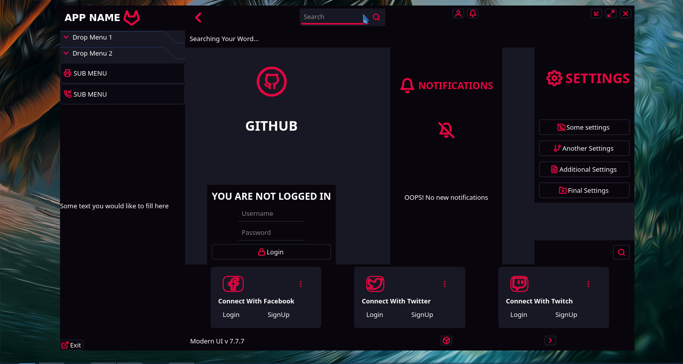
QCustomSidebar / QCustomSlideMenu
QCustomSidebar and QCustomSlideMenu are customizable, animated sidebar and sliding menu widgets that provide smooth transitions between collapsed and expanded states. They are perfect for creating responsive navigation panels, collapsible sidebars, and sliding menus in modern applications.
Overview
-
Smooth Animations:
Customizable slide transitions with various easing curves and durations. -
Multiple States:
Supports collapsed, expanded, and default size states with automatic detection. -
Floating Support:
Optional floating mode with positioning relative to parent container. -
Theme Integration:
Seamless integration with custom theme engine for consistent styling. -
Toggle Button Support:
Automatic button configuration for menu control with icon and style switching. -
Responsive Design:
Automatic size adjustment based on parent container or fixed dimensions.
Installation
pip install QT-PyQt-PySide-Custom-Widgets
Widget Classes
QCustomSidebar
Extended version of QCustomSlideMenu with additional properties and enhanced designer integration.
QCustomSlideMenu
Base class providing core sliding menu functionality.
Qt Designer Integration
Both widgets are available as plugins in Qt Designer. Simply drag and drop from the widget box:
- Find in Widget Box: Look for "QCustomSidebar" or "QCustomSlideMenu" in the custom widgets section
- Drag to Designer: Drag the widget to your form
- Configure Properties: Use the property editor to customize appearance and behavior
JSON Styling Configuration
Create a style.json file in your project root to configure the sidebar/menu:
Basic Configuration
{
  "QCustomSlideMenu": [{
    "name": "sidebarWidget"
  }]
}
Complete Configuration Example
{
  "QCustomSlideMenu": [{
    "name": "sidebarWidget",
    "defaultSize": [{
      "width": 250,
      "height": "auto"
    }],
    "collapsedSize": [{
      "width": 0,
      "height": "auto"
    }],
    "expandedSize": [{
      "width": 300,
      "height": "auto"
    }],
    "toggleButton": [{
      "buttonName": "toggleButton",
      "icons": [{
        "whenMenuIsCollapsed": ":/icons/icons/menu.svg",
        "whenMenuIsExpanded": ":/icons/icons/close.svg"
      }],
      "style": [{
        "whenMenuIsCollapsed": "background-color: #2c3e50; color: white;",
        "whenMenuIsExpanded": "background-color: #34495e; color: white;"
      }]
    }],
    "menuTransitionAnimation": [{
      "animationDuration": 500,
      "animationEasingCurve": "OutCubic",
      "whenCollapsing": [{
        "animationDuration": 400,
        "animationEasingCurve": "InCubic"
      }],
      "whenExpanding": [{
        "animationDuration": 400,
        "animationEasingCurve": "OutCubic"
      }]
    }],
    "menuContainerStyle": [{
      "whenMenuIsCollapsed": "background-color: #2c3e50; border: none;",
      "whenMenuIsExpanded": "background-color: #34495e; border-right: 1px solid #1a252f;"
    }],
    "floatPosition": [{
      "relativeTo": "centralwidget",
      "position": "left-center",
      "shadow": [{
        "color": "#000000",
        "blurRadius": 20,
        "xOffset": 0,
        "yOffset": 0
      }]
    }]
  }]
}
Key Configuration Options
Size Configuration
- defaultSize: Initial size when widget is created
- collapsedSize: Size when menu is minimized
- expandedSize: Size when menu is fully expanded
- Values: Integer pixels or "auto"/"parent" for dynamic sizing
Animation Configuration
- animationDuration: Default transition duration (ms)
- animationEasingCurve: Easing curve for transitions
- whenCollapsing/whenExpanding: Separate animation settings for each direction
Style Configuration
- menuContainerStyle: CSS styles for collapsed/expanded states
- toggleButton: Button configuration with icons and styles
- floatPosition: Floating menu positioning and shadow effects
Python API Usage
Basic Usage
from Custom_Widgets.QCustomSidebar import QCustomSidebar
from qtpy.QtWidgets import QApplication, QVBoxLayout, QWidget, QPushButton

app = QApplication([])

# Create main window
window = QWidget()
layout = QVBoxLayout(window)

# Create sidebar
sidebar = QCustomSidebar()

# Configure basic properties
sidebar.defaultWidth = 250
sidebar.collapsedWidth = 0
sidebar.expandedWidth = 300

# Add to layout
layout.addWidget(sidebar)
window.show()

app.exec_()
Advanced Configuration
# Configure sidebar with comprehensive settings
sidebar.customizeQCustomSlideMenu(
    # Size settings
    defaultWidth=250,
    defaultHeight="parent",
    collapsedWidth=0,
    collapsedHeight="parent",
    expandedWidth=300,
    expandedHeight="parent",

    # Animation settings
    animationDuration=500,
    animationEasingCurve=QEasingCurve.OutCubic,
    collapsingAnimationDuration=400,
    collapsingAnimationEasingCurve=QEasingCurve.InCubic,
    expandingAnimationDuration=400,
    expandingAnimationEasingCurve=QEasingCurve.OutCubic,

    # Style settings
    collapsedStyle="background-color: #2c3e50;",
    expandedStyle="background-color: #34495e; border-right: 1px solid #1a252f;",

    # Floating settings
    floatMenu=True,
    relativeTo=central_widget,
    position="left-center",
    shadowColor="#000000",
    shadowBlurRadius=20,
    shadowXOffset=0,
    shadowYOffset=0,

    # Toggle button
    toggleButtonName="menuToggleButton",
    iconWhenMenuIsCollapsed=":/icons/menu.svg",
    iconWhenMenuIsExpanded=":/icons/close.svg"
)
Control Methods
# Toggle between states
sidebar.slideMenu()

# Expand menu
sidebar.expandMenu()

# Collapse menu
sidebar.collapseMenu()

# Check current state
if sidebar.isExpanded():
    print("Sidebar is expanded")
elif sidebar.isCollapsed():
    print("Sidebar is collapsed")

# Refresh widget (reapply styles and positioning)
sidebar.refresh()
Property Access
# Size properties
sidebar.defaultWidth = 250
sidebar.collapsedWidth = 50
sidebar.expandedWidth = 300

# Animation properties
sidebar.animationDuration = 500
sidebar.animationEasingCurve = QEasingCurve.OutCubic

# Style properties
sidebar.containerStyleCollapsed = "background: #2c3e50;"
sidebar.containerStyleExpanded = "background: #34495e;"

# Floating properties
sidebar.float = True
sidebar.floatPosition = "left-center"
sidebar.autoHide = True

# Shadow properties
sidebar.shadowColor = QColor("#000000")
sidebar.shadowBlurRadius = 20
sidebar.shadowXOffset = 0
sidebar.shadowYOffset = 0
Signals
State Change Signals
# Connect to state changes
sidebar.onCollapsed.connect(lambda: print("Sidebar collapsed"))
sidebar.onExpanded.connect(lambda: print("Sidebar expanded"))
sidebar.onCollapsing.connect(lambda: print("Sidebar collapsing"))
sidebar.onExpanding.connect(lambda: print("Sidebar expanding"))
Floating Menu Positions
Available positions for floating menus:
- "top-left" - Top left corner
- "top-right" - Top right corner
- "top-center" - Top center
- "bottom-left" - Bottom left corner
- "bottom-right" - Bottom right corner
- "bottom-center" - Bottom center
- "center-center" - Center of parent
- "center-left" - Center left edge
- "center-right" - Center right edge
Easing Curves
Available animation easing curves:
- "Linear" - No easing
- "InQuad", "OutQuad", "InOutQuad" - Quadratic easing
- "InCubic", "OutCubic", "InOutCubic" - Cubic easing
- "InQuart", "OutQuart", "InOutQuart" - Quartic easing
- "InQuint", "OutQuint", "InOutQuint" - Quintic easing
- "InSine", "OutSine", "InOutSine" - Sinusoidal easing
- "InExpo", "OutExpo", "InOutExpo" - Exponential easing
- "InCirc", "OutCirc", "InOutCirc" - Circular easing
- "InElastic", "OutElastic", "InOutElastic" - Elastic easing
- "InBack", "OutBack", "InOutBack" - Back easing
- "InBounce", "OutBounce", "InOutBounce" - Bounce easing
Advanced Features
Auto-Hide Functionality
# Enable auto-hide (collapses when clicking outside)
sidebar.autoHide = True
Custom Margins
# Set margins for floating positioning
sidebar.marginTop = 10
sidebar.marginRight = 10
sidebar.marginBottom = 10
sidebar.marginLeft = 10
Dynamic Parent Sizing
# Size relative to parent container
sidebar.defaultWidth = "parent"
sidebar.defaultHeight = "parent"
Theme Integration
# Automatically applies theme colors and icons
# Works with QCustomTheme engine for consistent theming
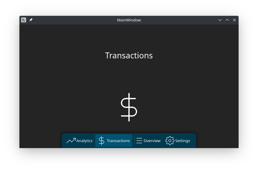
Complete Example
from Custom_Widgets.QCustomSidebar import QCustomSidebar
from qtpy.QtWidgets import QApplication, QMainWindow, QVBoxLayout, QWidget, QPushButton, QLabel
from qtpy.QtCore import QEasingCurve

class MainWindow(QMainWindow):
    def __init__(self):
        super().__init__()

        # Central widget
        central = QWidget()
        self.setCentralWidget(central)
        layout = QVBoxLayout(central)

        # Create sidebar
        self.sidebar = QCustomSidebar()

        # Configure sidebar
        self.sidebar.customizeQCustomSlideMenu(
            defaultWidth=250,
            collapsedWidth=0,
            expandedWidth=300,
            animationDuration=400,
            animationEasingCurve=QEasingCurve.OutCubic,
            collapsedStyle="background: #2c3e50;",
            expandedStyle="background: #34495e; border-right: 1px solid #1a252f;",
            floatMenu=True,
            position="left-center"
        )

        # Add content to sidebar
        sidebar_layout = QVBoxLayout(self.sidebar)
        sidebar_layout.addWidget(QLabel("Navigation"))
        sidebar_layout.addWidget(QPushButton("Home"))
        sidebar_layout.addWidget(QPushButton("Settings"))
        sidebar_layout.addWidget(QPushButton("About"))

        # Add toggle button
        self.toggle_btn = QPushButton("☰")
        self.toggle_btn.clicked.connect(self.sidebar.slideMenu)

        layout.addWidget(self.toggle_btn)
        layout.addWidget(self.sidebar)

        # Connect signals
        self.sidebar.onExpanded.connect(self.on_sidebar_expanded)
        self.sidebar.onCollapsed.connect(self.on_sidebar_collapsed)

    def on_sidebar_expanded(self):
        self.toggle_btn.setText("✕")

    def on_sidebar_collapsed(self):
        self.toggle_btn.setText("☰")

app = QApplication([])
window = MainWindow()
window.show()
app.exec_()
Additional Resources
- Video Tutorials: SPINN TV YouTube Channel
The QCustomSidebar and QCustomSlideMenu widgets provide powerful, customizable sliding menu functionality perfect for modern application interfaces with smooth animations and responsive behavior.