QCustomQPushButton
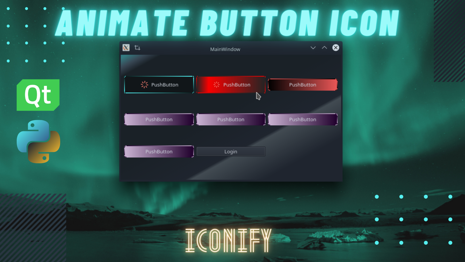
QCustomQPushButton is a highly customizable button widget that extends Qt's standard QPushButton with advanced animations, themes, icons, and shadow effects. It provides a modern, interactive button experience with extensive styling options.
Overview
-
Animated Transitions:
Smooth background, border, and shadow animations with customizable easing curves. -
Predefined Themes:
13 built-in color themes with gradient effects and border animations. -
Custom Themes:
Support for custom color combinations with gradient or uniform backgrounds. -
Icon Integration:
Seamless integration with Iconify library for vector icons with animations. -
Shadow Effects:
Configurable drop shadows with animation capabilities. -
Event-Driven Animations:
Animations triggered by hover, click, or other user interactions.
Installation
pip install QT-PyQt-PySide-Custom-Widgets
Quick Start
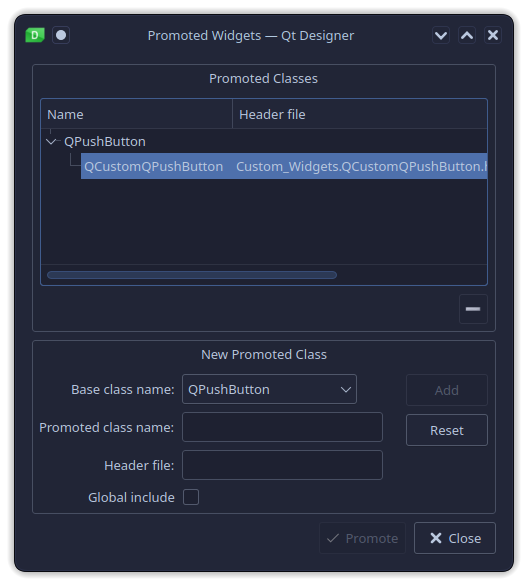
1. Promote QPushButton in Qt Designer
- Add a
QPushButtonto your interface - Right-click and select "Promote widgets..."
- Configure promotion:
- Base class name:
QPushButton - Promote class name:
QCustomQPushButton - Header file:
Custom_Widgets.QCustomQPushButton.h
- Base class name:
2. Basic Usage
from Custom_Widgets import QCustomQPushButton

# Create custom button
button = QCustomQPushButton("Click Me")

# Apply theme
button.setObjectTheme(2)  # Theme number 2

# Set animation trigger
button.setObjectAnimateOn("hover")
Theming
Predefined Themes
Apply one of 13 built-in themes:
# Apply theme 1-13
button.setObjectTheme(1)   # Dark teal gradient
button.setObjectTheme(2)   # Pink to cyan gradient
button.setObjectTheme(3)   # Lime to dark gradient
# ... up to theme 13
Custom Themes
Create custom color themes:
# Gradient background
button.setObjectCustomTheme("#2596be", "#1CB5E0")

# Uniform background
button.setObjectCustomTheme("#ffffff", "#ffffff")
Animations
Animation Types
# Animate background only
button.setObjectAnimation("background")

# Animate border only
button.setObjectAnimation("border")

# Animate both (default)
button.setObjectAnimation("both")
Animation Triggers
# Animate on hover
button.setObjectAnimateOn("hover")

# Animate on click
button.setObjectAnimateOn("click")
Animation Configuration
# Set duration
button._animation.setDuration(1000)  # 1 second

# Set easing curve
from qtpy.QtCore import QEasingCurve
button._animation.setEasingCurve(QEasingCurve.InOutElastic)
Icon System
Basic Icon Setup
from Custom_Widgets import iconify

# Apply icon
iconify(
    button,
    icon="font-awesome:solid:cloud-download-alt"
)
Icon Customization
iconify(
    button,
    icon="feather:loader",
    color="#ffffff",      # Icon color
    size=32,             # Icon size
    animation="spin",    # Animation type
    animateOn="hover"    # Trigger event
)
Available Animations
"spin"- Continuous rotation"breathe"- Pulsing opacity effect"spin and breathe"- Combined effects
Trigger Events
"hover"- Animate on mouse hover"click"- Animate on mouse click"all"- Always animated
Shadow Effects
Basic Shadow
from Custom_Widgets import applyButtonShadow

applyButtonShadow(button)
Custom Shadow Configuration
applyButtonShadow(
    button,
    color="#ffffff",           # Shadow color
    blurRadius=100,           # Blur intensity
    xOffset=2,                # Horizontal offset
    yOffset=2,                # Vertical offset
    animateShadow=True,       # Enable animation
    applyShadowOn="hover",    # Trigger event
    animateShadowDuration=500 # Animation duration
)
Shadow Trigger Events
"hover"- Show shadow on hover"click"- Show shadow on click- (None) - Always visible
Advanced Styling
Default Style
Style applied during and after animations:
button.setObjectDefaultStyle("""
    border-style: solid;
    border-width: 2px;
    border-radius: 3px;
    color: #d3dae3;
    padding: 5px;
""")
Fallback Style
Style applied after animation completes:
button.setObjectFallBackStyle("""
    background-color: green;
    border: 1px solid darkgreen;
""")
JSON Configuration
Basic Structure
{
  "QPushButton": [
    {
      "name": "myButton",
      "theme": "2",
      "animateOn": "hover"
    }
  ]
}
Complete JSON Example
{
  "QPushButton": [
    {
      "name": "pushButton",
      "customTheme": [
        {
          "color1": "#2596be",
          "color2": "rgb(37, 150, 190)"
        }
      ],
      "animateOn": "hover",
      "animation": "both",
      "animationDuration": 1000,
      "iconify": [
        {
          "icon": "dash:admin-generic",
          "color": "white",
          "size": 32,
          "animation": "breathe",
          "animateOn": "hover"
        }
      ],
      "shadow": [
        {
          "color": "white",
          "applyShadowOn": "hover",
          "animateShadow": true,
          "animateShadowDuration": 500,
          "blurRadius": 100,
          "xOffset": 2,
          "yOffset": 2
        }
      ],
      "defaultStyle": [
        "border-style: solid;",
        "border-width: 2px;",
        "border-radius: 3px;",
        "color: #d3dae3;",
        "padding: 5px;"
      ],
      "fallBackStyle": [
        "background-color: green"
      ]
    }
  ]
}
Loading JSON Styles
from Custom_Widgets import loadJsonStyle

# Apply JSON styles
loadJsonStyle(self, self.ui)

# Check if button was themed
if not button.wasThemed:
    # Apply fallback styling
    applyAnimationThemeStyle(button, 2)
Complete Example
from qtpy.QtWidgets import QApplication, QWidget, QVBoxLayout
from Custom_Widgets import QCustomQPushButton, iconify, applyButtonShadow

app = QApplication([])

# Create main window
window = QWidget()
layout = QVBoxLayout(window)

# Create custom button
button = QCustomQPushButton("Animated Button")

# Apply theme and animations
button.setObjectTheme(2)
button.setObjectAnimateOn("hover")
button._animation.setDuration(800)

# Add icon with animation
iconify(
    button,
    icon="font-awesome:solid:rocket",
    color="#ffffff",
    size=24,
    animation="spin",
    animateOn="hover"
)

# Apply shadow
applyButtonShadow(
    button,
    color="rgba(0,0,0,50)",
    blurRadius=20,
    animateShadow=True,
    applyShadowOn="hover"
)

# Set custom styles
button.setObjectDefaultStyle("""
    border: 2px solid transparent;
    border-radius: 5px;
    padding: 10px 20px;
    color: white;
    font-weight: bold;
""")

layout.addWidget(button)
window.show()
app.exec_()
Event Handling
Mouse Events
- enterEvent: Triggered when mouse enters button
- leaveEvent: Triggered when mouse leaves button
- mousePressEvent: Triggered on mouse button press
- mouseReleaseEvent: Triggered on mouse button release
Animation States
- Forward: Plays animation from start to end
- Backward: Plays animation from end to start
- Finished: Emitted when animation completes
Customization Reference
Theme Colors
| Theme | Color 1 | Color 2 |
|---|---|---|
| 1 | #091b1b | #55ffff |
| 2 | #f035da | #3dd9f5 |
| 3 | #c0db50 | #100e19 |
| ... | ... | ... |
Easing Curves
LinearInQuad,OutQuad,InOutQuadInCubic,OutCubic,InOutCubicInElastic,OutElastic,InOutElastic- And many more Qt easing curves
Icon Libraries
- Font Awesome:
font-awesome:solid:icon-name - Feather:
feather:icon-name - Material Design:
material-design:icon-name - Dash:
dash:icon-name
Additional Resources
Video Tutorials
- Customize QPushButton Animations, Shadow, Border, Background, Icon - Modern GUI Design
- Animate QPushButton, Install Font Libraries, Using ICONIFY Library
Example Downloads
The QCustomQPushButton provides a comprehensive solution for creating modern, interactive buttons with extensive customization options for animations, themes, icons, and shadows.