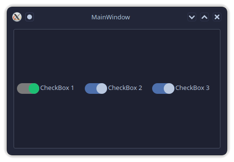
QCustomCheckBox
QCustomCheckBox is a custom animated checkbox widget that provides a modern, switch-like interface with smooth transitions and customizable styling. It extends Qt's standard QCheckBox with enhanced visual effects and animation capabilities.
Overview
-
Modern Switch Design:
Features a sleek, toggle-switch appearance instead of traditional checkbox styling. -
Smooth Animations:
Includes customizable transition animations with various easing curves. -
Customizable Colors:
Supports complete color customization for background, circle, and active states. -
Icon Support:
Optional icon display alongside the checkbox text. -
Designer Integration:
Provides XML description and icon for seamless Qt Designer integration.
Constructor
QCustomCheckBox(parent=None)
- parent:
The parent widget (defaults toNone).
Key Properties
backgroundColor (QColor)
-
Purpose:
Background color of the checkbox in unchecked state. -
Getter:
Returns the current background color. -
Setter:
Updates the background color and triggers repaint. -
Example:
checkbox.backgroundColor = QColor("#c3c3c3")
circleColor (QColor)
-
Purpose:
Color of the sliding circle indicator. -
Getter:
Returns the current circle color. -
Setter:
Updates the circle color and triggers repaint. -
Example:
checkbox.circleColor = QColor("#ffffff")
activeColor (QColor)
-
Purpose:
Background color when the checkbox is checked/active. -
Getter:
Returns the current active color. -
Setter:
Updates the active color and triggers repaint. -
Example:
checkbox.activeColor = QColor("#17a8e3")
animationDuration (int)
-
Purpose:
Duration of the toggle animation in milliseconds. -
Getter:
Returns the current animation duration. -
Setter:
Updates the animation duration. -
Example:
checkbox.animationDuration = 500
animationEasingCurve (QEasingCurve)
-
Purpose:
Easing curve for the toggle animation. -
Getter:
Returns the current easing curve. -
Setter:
Updates the animation easing curve. -
Example:
checkbox.animationEasingCurve = QEasingCurve.OutCubic
Methods
customizeQCustomCheckBox(**customValues)
-
Description:
Applies multiple customization properties at once. -
Parameters:
bgColor: Background color in unchecked statecircleColor: Sliding circle coloractiveColor: Background color when checkedanimationEasingCurve: Animation easing curveanimationDuration: Animation duration in milliseconds
-
Example:
checkbox.customizeQCustomCheckBox(
    bgColor="#c3c3c3",
    circleColor="#fff",
    activeColor="#17a8e3",
    animationEasingCurve=QEasingCurve.Linear,
    animationDuration=200
)
setIcon(icon)
-
Description:
Sets an icon to display alongside the checkbox. -
Parameters:
icon: QIcon object to display.
setIconSize(size)
-
Description:
Sets the size of the checkbox icon. -
Parameters:
size: QSize object specifying icon dimensions.
setText(text)
-
Description:
Sets the checkbox label text. -
Parameters:
text: String to display as label.
adjustWidgetSize()
- Description:
Internal method that adjusts widget layout and sizing.
Usage Example
Basic Usage
from qtpy.QtWidgets import QApplication, QVBoxLayout, QWidget
from Custom_Widgets.QCustomCheckBox import QCustomCheckBox

app = QApplication([])

# Create main window
window = QWidget()
layout = QVBoxLayout(window)

# Create custom checkbox
checkbox = QCustomCheckBox()
checkbox.setText("Enable Feature")
checkbox.setChecked(True)

layout.addWidget(checkbox)
window.show()

app.exec_()
Custom Styling from Python
from qtpy.QtCore import QEasingCurve

# Create checkbox
checkbox = QCustomCheckBox()

# Apply custom styling
checkbox.customizeQCustomCheckBox(
    bgColor="#2e3739",
    circleColor="#1dbf73",
    activeColor="#7b7b7b",
    animationEasingCurve=QEasingCurve.InOutCubic,
    animationDuration=500
)

# Set text
checkbox.setText("Dark Mode")

# Connect state change signal
def on_state_changed(state):
    print(f"Checkbox state: {bool(state)}")

checkbox.stateChanged.connect(on_state_changed)
With Icons
from qtpy.QtGui import QIcon
from qtpy.QtCore import QSize

# Create checkbox with icon
checkbox = QCustomCheckBox()

# Set icon
checkbox.setIcon(QIcon("path/to/icon.png"))
checkbox.setIconSize(QSize(24, 24))

# Set text
checkbox.setText("Premium Feature")

# Style with colors that match the icon
checkbox.customizeQCustomCheckBox(
    bgColor="#f0f0f0",
    circleColor="#ffd700",  # Gold circle to match premium theme
    activeColor="#28a745"   # Green active state
)
JSON Styling
Create a JSON file json-style.json:
{
  "QCustomCheckBox": [
    {
      "name": "checkBox_3",
      "bgColor": "#2e3739",
      "circleColor": "#1dbf73",
      "activeColor": "#7b7b7b",
      "animationEasingCurve": "InOutCubic",
      "animationDuration": 500
    }
  ]
}
Then load it in your application:
from Custom_Widgets import loadJsonStyle

# Load JSON styles
loadJsonStyle(self, jsonFiles={"json-style.json"})
Animation Features
Supported Easing Curves
LinearInQuad,OutQuad,InOutQuadInCubic,OutCubic,InOutCubicInQuart,OutQuart,InOutQuartInQuint,OutQuint,InOutQuintInSine,OutSine,InOutSineInExpo,OutExpo,InOutExpoInCirc,OutCirc,InOutCircInElastic,OutElastic,InOutElasticInBack,OutBack,InOutBackInBounce,OutBounce,InOutBounce
Animation Properties
- Default Duration: 300ms
- Default Curve:
QEasingCurve.OutBounce - Smooth Transitions: Position-based animation
Visual Design
Dimensions
- Aspect Ratio: Fixed 2.1:1 width-to-height ratio
- Rounded Corners: Half the height for perfect pill shape
- Circle Size: Matches checkbox height
Layout
- Checkbox Area: Left side with animated toggle
- Icon Area: Optional icon display
- Text Area: Right side with label text
- Automatic Sizing: Adjusts based on content
Interactive Features
- Cursor: Pointing hand cursor indicates clickability
- Hit Area: Entire widget is clickable
- Visual Feedback: Smooth state transitions
Additional Notes
-
Theme Compatibility:
Automatically adapts to system theme colors by default. -
Accessibility:
Maintains standard checkbox accessibility features. -
Performance:
Efficient animation system usingQPropertyAnimation. -
Customization:
Extensive styling options while maintaining native Qt behavior. -
Integration:
Works seamlessly with existing Qt layouts and stylesheets.
The QCustomCheckBox is perfect for modern applications requiring sleek toggle switches, settings panels, preference dialogs, and any interface where visual appeal and smooth interactions are important.