QCustomThemeDarkLightToggle
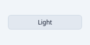
QPushButton(self, text: str, /, parent: PySide6.QtWidgets.QWidget | None = None, *, autoDefault: bool | None = None, default: bool | None = None, flat: bool | None = None) -> None
QPushButton(self, icon: PySide6.QtGui.QIcon | PySide6.QtGui.QPixmap, text: str, /, parent: PySide6.QtWidgets.QWidget | None = None, *, autoDefault: bool | None = None, default: bool | None = None, flat: bool | None = None) -> None QPushButton(self, /, parent: PySide6.QtWidgets.QWidget | None = None, *, autoDefault: bool | None = None, default: bool | None = None, flat: bool | None = None) -> None
At a glance
| Tier | Free (GPLv3) |
| Import | from Custom_Widgets.QCustomThemeDarkLightToggle import QCustomThemeDarkLightToggle |
| Qt Designer | Yes — drag it from the palette |
Quick start
from Custom_Widgets.QCustomThemeDarkLightToggle import QCustomThemeDarkLightToggle

widget = QCustomThemeDarkLightToggle()
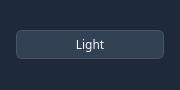
Dark theme
Colours come from the design tokens, so the widget follows the app theme with no extra work.
Properties
Every property below is settable in code and in Qt Designer.
| Property | Type | Default |
|---|---|---|
text | string | — |
icon | QIcon | — |
iconSize | QSize | — |
shortcut | QKeySequence | — |
checkable | bool | — |
checked | bool | — |
autoRepeat | bool | — |
autoExclusive | bool | — |
autoRepeatDelay | int | — |
autoRepeatInterval | int | — |
down | bool | — |
autoDefault | bool | — |
default | bool | — |
flat | bool | — |
darkTheme | string | — |
lightTheme | string | — |
updateLabelText | bool | — |
updateButtonIcon | bool | — |
darkThemeIcon | QIcon | — |
lightThemeIcon | QIcon | — |
Methods
| Method | Description |
|---|---|
darkTheme(*args, **kwargs) | Name of the CUSTOM dark theme this toggle flips to (paired with |
darkThemeIcon(*args, **kwargs) | Dark theme icon. |
lightTheme(*args, **kwargs) | Name of the CUSTOM light theme this toggle flips to. |
lightThemeIcon(*args, **kwargs) | Light theme icon. |
setText(text: str) | Set the text. |
toggle_theme() | Toggle theme. |
updateButtonIcon(*args, **kwargs) | Update the button icon. |
updateLabelText(*args, **kwargs) | Update the label text. |
update_button_icon() | Update the button icon based on the current theme. |
update_button_text() | Set the button text based on the current theme. |
Related
QCustomActionButton · QCustomCopyButton · QCustomQPushButton · QCustomQPushButtonGroup · QCustomRainbowButton · QCustomSocialButton · QCustomTileButton