QCustomTileButton
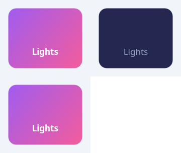
A selectable device / action TILE.
A rounded-rectangle button with a line ICON above a CAPTION — the classic smart-home / launcher tile. It is CHECKABLE: the selected tile paints a two-stop diagonal GRADIENT (e.g. purple->pink) with light icon+text, the rest paint a flat card fill with muted icon+text. Painted with QPainter so it stays crisp at any size and recolours on a theme switch (all colours are qproperties); the icon is a recoloured SVG so it flips light/muted with the selected state.
Give it an icon with iconPath (an .svg) + a caption in code or Qt
Designer. It is a QAbstractButton, so it emits clicked()/toggled(bool) and
participates in a QButtonGroup for single-select device grids.
At a glance
| Tier | Free (GPLv3) |
| Import | from Custom_Widgets.QCustomTileButton import QCustomTileButton |
| Qt Designer | Yes — drag it from the palette |
Quick start
from Custom_Widgets.QCustomTileButton import QCustomTileButton

widget = QCustomTileButton()
Dark theme
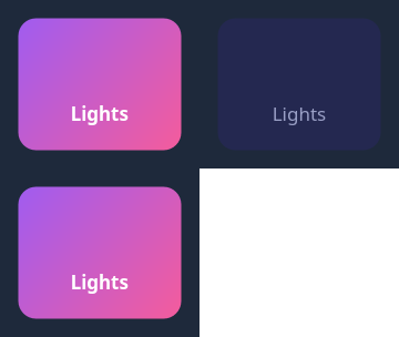
Colours come from the design tokens, so the widget follows the app theme with no extra work.
Properties
Every property below is settable in code and in Qt Designer.
| Property | Type | Default |
|---|---|---|
text | string | — |
icon | QIcon | — |
iconSize | int | 34 |
shortcut | QKeySequence | — |
checkable | bool | — |
checked | bool | — |
autoRepeat | bool | — |
autoExclusive | bool | — |
autoRepeatDelay | int | — |
autoRepeatInterval | int | — |
down | bool | — |
caption | string | Lights |
iconPath | string | — |
gradientStart | color | #a05cf0 |
gradientEnd | color | #f45c9c |
bgColor | color | #242850 |
iconColor | color | #9aa0c6 |
activeColor | color | #ffffff |
cornerRadius | int | 16 |
Methods
| Method | Description |
|---|---|
activeColor(*args, **kwargs) | Active color. |
bgColor(*args, **kwargs) | Bg color. |
caption(*args, **kwargs) | Caption. |
cornerRadius(*args, **kwargs) | Corner radius. |
gradientEnd(*args, **kwargs) | Gradient end. |
gradientStart(*args, **kwargs) | Gradient start. |
iconColor(*args, **kwargs) | Icon color. |
iconPath(*args, **kwargs) | Icon path. |
iconSize(*args, **kwargs) | Icon size. |
setCaption(text) | Set the caption. |
setGradient(start, end) | Set the gradient. |
setIconPath(path) | Set the icon path. |
Related
QCustomActionButton · QCustomCopyButton · QCustomQPushButton · QCustomQPushButtonGroup · QCustomRainbowButton · QCustomSocialButton · QCustomThemeDarkLightToggle