QCustomChatBubble
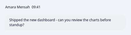
A single chat message bubble.
The core building block of a messenger thread: a rounded, tail-cornered
bubble that wraps its text with a REAL font (a QLabel, not painted glyphs),
sized to its content up to a max width, and self-aligned to the left
(incoming) or right (outgoing) inside a full-width thread row. An optional
meta line above (sender + time) and an optional foot line below (delivery /
credits-cost) round out the anatomy seen in real chat UIs. Every colour is a
qproperty so incoming/outgoing bubbles flip with the theme; the side
drives the default palette, the tail corner and the alignment. Set the body
through text, or embed any widget (a voice message, an image) with
setBodyWidget() to reuse the same bubble chrome.
At a glance
| Tier | Free (GPLv3) |
| Import | from Custom_Widgets.QCustomChatBubble import QCustomChatBubble |
| Qt Designer | Yes — drag it from the palette |
Quick start
from Custom_Widgets.QCustomChatBubble import QCustomChatBubble

widget = QCustomChatBubble()
widget.setSender("Amara Mensah")
widget.setText("Shipped the new dashboard - can you review the charts "
      "before standup?")
widget.setTime("09:41")
That is the exact code behind the screenshot above.
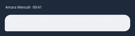
Dark theme
Colours come from the design tokens, so the widget follows the app theme with no extra work.
Properties
Every property below is settable in code and in Qt Designer.
| Property | Type | Default |
|---|---|---|
frameShape | QFrame::Shape | — |
frameShadow | QFrame::Shadow | — |
lineWidth | int | — |
midLineWidth | int | — |
frameWidth | int | — |
frameRect | QRect | — |
text | string | Hey Ricky! I'm feeling amazing, how about you? |
side | enum: incoming/outgoing`` | incoming |
sender | string | — |
time | string | — |
foot | string | — |
bubbleColor | color | #eef0f4 |
textColor | color | #1f2430 |
metaColor | color | #8a93a6 |
radius | int | 20 |
maxBubbleWidth | int | 420 |
Methods
| Method | Description |
|---|---|
bubbleColor(*args, **kwargs) | Bubble color. |
foot(*args, **kwargs) | Foot. |
maxBubbleWidth(*args, **kwargs) | Max bubble width. |
metaColor(*args, **kwargs) | Meta color. |
radius(*args, **kwargs) | Radius. |
sender(*args, **kwargs) | Sender. |
setBodyPadding(h, v) | Tighten (or pad) the bubble body — e.g. 0 for an edge-to-edge inline |
setBodyWidget(widget) | Replace the text label with an arbitrary widget (voice message, |
setFoot(text) | Set the foot. |
setMetaWidget(widget) | Add a small widget after the meta line (e.g. QCustomMessageStatus |
setReactionBar(widget) | Attach a reactions row (e.g. QCustomReactionBar) below the bubble, |
setSender(text) | Set the sender. |
setText(text) | Set the text. |
setTime(text) | Set the time. |
side(*args, **kwargs) | Side. |
text(*args, **kwargs) | Text. |
textColor(*args, **kwargs) | Text color. |
time(*args, **kwargs) | Time. |
Related
QCustomChatDivider · QCustomChatInput · QCustomChatList · QCustomChatListItem · QCustomChatThread · QCustomMessageStatus · QCustomReactionBar · QCustomTypingIndicator