QCustomMenu
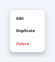
A modern popup action menu.
A frameless, rounded, elevated popup for the "..." / more buttons: a column of icon + label action rows with hover states, optional separators and a right-aligned hint. Open it anchored under a button with popupAt(button). Emits triggered(key) when an item is picked. Theme it from code with applyColors(...) so it flips with the app theme (it is a top-level popup, so the app stylesheet does not cascade in automatically).
At a glance
| Tier | Free (GPLv3) |
| Import | from Custom_Widgets.QCustomMenu import QCustomMenu |
| Qt Designer | Yes — drag it from the palette |
Quick start
from Custom_Widgets.QCustomMenu import QCustomMenu

widget = QCustomMenu()
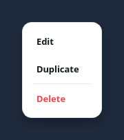
Dark theme
Colours come from the design tokens, so the widget follows the app theme with no extra work.
Properties
Every property below is settable in code and in Qt Designer.
| Property | Type | Default |
|---|---|---|
itemHeight | int | 38 |
cornerRadius | int | 14 |
minWidth | int | 200 |
Signals
| Signal |
|---|
triggered(QString) |
Methods
| Method | Description |
|---|---|
addAction(text, key=None, icon=None, hint='', danger=False) | Add an action row. icon may be a QIcon or QPixmap. Returns the key. |
addSeparator() | Add a separator. |
applyColors(bg=None, text=None, muted=None, hover=None, border=None, accent=None, danger=None) | Apply the colors. |
clear() | Clear. |
cornerRadius(*args, **kwargs) | Corner radius. |
itemHeight(*args, **kwargs) | Item height. |
minWidth(*args, **kwargs) | Min width. |
popupAt(anchor, align='right', gap=4) | Show the menu just below anchor, right- or left-aligned to it. |
popupAtPos(global_pos) | Popup at pos. |
triggered(...) | Triggered. |
Related
QCustomBreadcrumbs · QCustomCommandPalette · QCustomDrawer · QCustomHamburgerMenu · QCustomHeaderNav · QCustomPagination · QCustomSidebar · QCustomSidebarButton