QCustomDateEdit
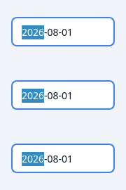
/ QCustomTimeEdit / QCustomDateRangeEdit
Tokenized date & time inputs built on Qt's date/time editors (correct calendar popup, keyboard entry and validation) plus a two-field date range picker that keeps start <= end. Styled from design tokens; the calendar popup is scoped via the object name "customCalendar".
At a glance
| Tier | Free (GPLv3) |
| Import | from Custom_Widgets.QCustomDateTimeEdit import QCustomDateEdit |
| Qt Designer | Yes — drag it from the palette |
Quick start
from Custom_Widgets.QCustomDateTimeEdit import QCustomDateEdit

widget = QCustomDateEdit()
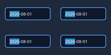
Dark theme
Colours come from the design tokens, so the widget follows the app theme with no extra work.
Properties
Every property below is settable in code and in Qt Designer.
| Property | Type | Default |
|---|---|---|
wrapping | bool | — |
frame | bool | — |
alignment | QFlags<Qt::AlignmentFlag> | — |
readOnly | bool | — |
buttonSymbols | QAbstractSpinBox::ButtonSymbols | — |
specialValueText | string | — |
text | string | — |
accelerated | bool | — |
correctionMode | QAbstractSpinBox::CorrectionMode | — |
acceptableInput | bool | — |
keyboardTracking | bool | — |
showGroupSeparator | bool | — |
dateTime | QDateTime | — |
date | QDate | — |
time | QTime | — |
maximumDateTime | QDateTime | — |
minimumDateTime | QDateTime | — |
maximumDate | QDate | — |
minimumDate | QDate | — |
maximumTime | QTime | — |
minimumTime | QTime | — |
currentSection | QDateTimeEdit::Section | — |
displayedSections | QFlags<QDateTimeEdit::Section> | — |
displayFormat | string | — |
calendarPopup | bool | — |
currentSectionIndex | int | — |
sectionCount | int | — |
timeSpec | Qt::TimeSpec | — |
timeZone | QTimeZone | — |
date | QDate | — |
variant | enum: primary/secondary/outline/ghost`` | outline |
sizeVariant | enum: sm/md/lg`` | md |
Theming
Colours come from the design tokens, so they follow the active theme. Roles used: surface, on-surface, surface-muted, outline, accent, on-primary, focus-ring.
See Design tokens.
Related
QCustomButtonGroup · QCustomCheckBox · QCustomColorPicker · QCustomComboBox · QCustomDateRangeEdit · QCustomDateRangePicker · QCustomEmojiPicker · QCustomFileDropZone