QCustomTextArea
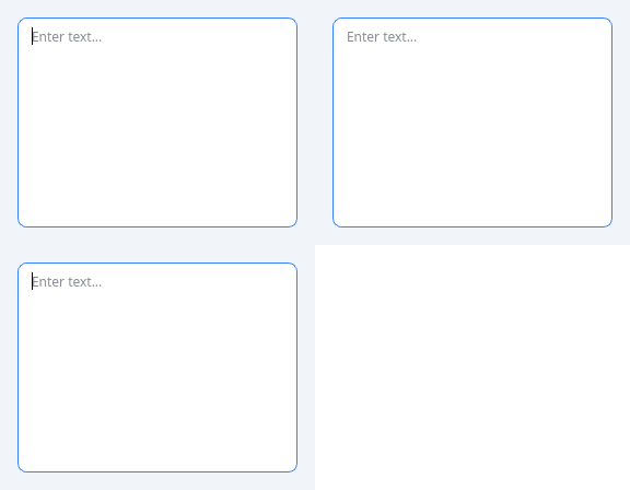
A multi-line text input.
The catalog had no multi-line input at all: QCustomInput extends QLineEdit, which is single-line by construction, so any form needing a comment, description or message body had to drop to a bare QPlainTextEdit and lose the token styling.
Built on QPlainTextEdit rather than QTextEdit: this is a plain-text control, and QPlainTextEdit's line-based layout stays fast on long input where QTextEdit's rich document does not.
Adds over the stock widget:
- variant / sizeVariant / state, mirroring QCustomInput
- maxLength with a live character counter
- autoGrow, so the field grows with its content between minRows and maxRows
Emits lengthChanged(int) and limitReached(bool) alongside the inherited textChanged.
At a glance
| Tier | Free (GPLv3) |
| Import | from Custom_Widgets.QCustomTextArea import QCustomTextArea |
| Qt Designer | Yes — drag it from the palette |
Quick start
from Custom_Widgets.QCustomTextArea import QCustomTextArea

widget = QCustomTextArea()
Dark theme
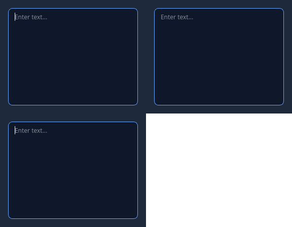
Colours come from the design tokens, so the widget follows the app theme with no extra work.
Properties
Every property below is settable in code and in Qt Designer.
| Property | Type | Default |
|---|---|---|
frameShape | QFrame::Shape | — |
frameShadow | QFrame::Shadow | — |
lineWidth | int | — |
midLineWidth | int | — |
frameWidth | int | — |
frameRect | QRect | — |
verticalScrollBarPolicy | Qt::ScrollBarPolicy | — |
horizontalScrollBarPolicy | Qt::ScrollBarPolicy | — |
sizeAdjustPolicy | QAbstractScrollArea::SizeAdjustPolicy | — |
tabChangesFocus | bool | — |
documentTitle | string | — |
undoRedoEnabled | bool | — |
lineWrapMode | QPlainTextEdit::LineWrapMode | — |
readOnly | bool | — |
plainText | string | — |
overwriteMode | bool | — |
tabStopDistance | float | — |
cursorWidth | int | — |
textInteractionFlags | QFlags<Qt::TextInteractionFlag> | — |
blockCount | int | — |
maximumBlockCount | int | — |
backgroundVisible | bool | — |
centerOnScroll | bool | — |
placeholderText | string | — |
variant | enum: primary/secondary/outline/ghost`` | outline |
sizeVariant | enum: sm/md/lg`` | md |
state | enum: default/focused/error/disabled`` | default |
maxLength | int | 0 |
showCounter | bool | False |
autoGrow | bool | False |
minRows | int | 3 |
maxRows | int | 8 |
counterColor | color | — |
counterOverColor | color | — |
Signals
| Signal |
|---|
lengthChanged(int) |
limitReached(bool) |
Methods
| Method | Description |
|---|---|
autoGrow(*args, **kwargs) | Auto grow. |
clearText() | Clear the text. |
counterColor(*args, **kwargs) | Counter color. |
counterOverColor(*args, **kwargs) | Counter over color. |
isOverLimit() | Return whether the widget is over limit. |
length() | Length. |
lengthChanged(...) | Length changed. |
limitReached(...) | Limit reached. |
maxLength(*args, **kwargs) | Max length. |
maxRows(*args, **kwargs) | Max rows. |
minRows(*args, **kwargs) | Min rows. |
remaining() | Characters left, or -1 when no limit is set. |
setError(error_text=None) | Set the error. |
showCounter(*args, **kwargs) | Show the counter. |
sizeVariant(*args, **kwargs) | Size variant. |
state(*args, **kwargs) | State. |
variant(*args, **kwargs) | Variant. |
Theming
Colours come from the design tokens, so they follow the active theme. Roles used: destructive, focus-ring, on-surface, outline, surface, surface-muted.
See Design tokens.
Runnable example
A complete app using this widget lives at examples/PySide6/QCustomTextArea/main.py.
Related
QCustomButtonGroup · QCustomCheckBox · QCustomColorPicker · QCustomComboBox · QCustomDateEdit · QCustomDateRangeEdit · QCustomDateRangePicker · QCustomEmojiPicker