QCustomInput
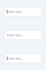
A modern text input with design-token variants and sizes.
Replaces hand-crafted QLineEdit styling with a tokenized API:
- variant: "primary" | "secondary" | "outline" (default) | "ghost"
- sizeVariant: "sm" | "md" (default) | "lg"
- state: "default" | "focused" | "error" | "disabled"
Works seamlessly with QCustomForm fields.
At a glance
| Tier | Free (GPLv3) |
| Import | from Custom_Widgets.QCustomInput import QCustomInput |
| Qt Designer | Yes — drag it from the palette |
Quick start
from Custom_Widgets.QCustomInput import QCustomInput

widget = QCustomInput()
Dark theme
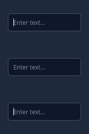
Colours come from the design tokens, so the widget follows the app theme with no extra work.
Properties
Every property below is settable in code and in Qt Designer.
| Property | Type | Default |
|---|---|---|
inputMask | string | — |
text | string | — |
maxLength | int | — |
frame | bool | — |
echoMode | QLineEdit::EchoMode | — |
displayText | string | — |
cursorPosition | int | — |
alignment | QFlags<Qt::AlignmentFlag> | — |
modified | bool | — |
hasSelectedText | bool | — |
selectedText | string | — |
dragEnabled | bool | — |
readOnly | bool | — |
undoAvailable | bool | — |
redoAvailable | bool | — |
acceptableInput | bool | — |
placeholderText | string | — |
cursorMoveStyle | Qt::CursorMoveStyle | — |
clearButtonEnabled | bool | — |
variant | enum: primary/secondary/outline/ghost`` | outline |
sizeVariant | enum: sm/md/lg`` | md |
state | string | — |
Methods
| Method | Description |
|---|---|
setError(error_text=None) | Set the input to error state and optionally show an error message. |
sizeVariant(*args, **kwargs) | Size variant. |
state(*args, **kwargs) | State. |
variant(*args, **kwargs) | Variant. |
Related
QCustomButtonGroup · QCustomCheckBox · QCustomColorPicker · QCustomComboBox · QCustomDateEdit · QCustomDateRangeEdit · QCustomDateRangePicker · QCustomEmojiPicker