QCustomComboBox
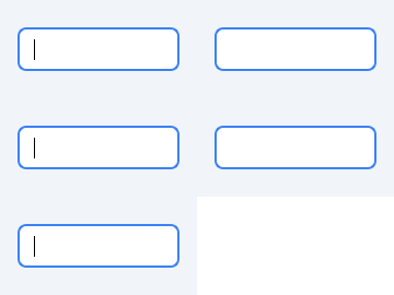
A searchable / autocomplete select.
Built on QComboBox + QCompleter so keyboard navigation, popup filtering and focus handling are correct, with a tokenized look and a convenient items API. Editable mode gives type-to-filter (substring) autocomplete; the arrow still shows the full list.
c = QCustomComboBox() c.setItems(["Apple", "Banana", ("Grape", 3), {"label": "Kiwi", "value": 9}]) c.currentData(); c.currentText()
At a glance
| Tier | Free (GPLv3) |
| Import | from Custom_Widgets.QCustomComboBox import QCustomComboBox |
| Qt Designer | Yes — drag it from the palette |
Quick start
from Custom_Widgets.QCustomComboBox import QCustomComboBox

widget = QCustomComboBox()
Dark theme
Colours come from the design tokens, so the widget follows the app theme with no extra work.

Properties
Every property below is settable in code and in Qt Designer.
| Property | Type | Default |
|---|---|---|
editable | bool | True |
count | int | — |
currentText | string | — |
currentIndex | int | — |
currentData | QVariant | — |
maxVisibleItems | int | — |
maxCount | int | — |
insertPolicy | QComboBox::InsertPolicy | — |
sizeAdjustPolicy | QComboBox::SizeAdjustPolicy | — |
minimumContentsLength | int | — |
iconSize | QSize | — |
placeholderText | string | — |
duplicatesEnabled | bool | — |
frame | bool | — |
modelColumn | int | — |
labelDrawingMode | QComboBox::LabelDrawingMode | — |
variant | enum: primary/secondary/outline/ghost`` | outline |
sizeVariant | enum: sm/md/lg`` | md |
Methods
| Method | Description |
|---|---|
currentValue() | Alias for currentData(). |
placeholderText() | Placeholder text. |
setEditable(editable) | Set the editable. |
setItems(items) | Replace all items. Each item may be a string, a (label, data) pair, |
setPlaceholderText(text) | Set the placeholder text. |
sizeVariant(*args, **kwargs) | Size variant. |
variant(*args, **kwargs) | Variant. |
Theming
Colours come from the design tokens, so they follow the active theme. Roles used: surface, on-surface, outline, accent, on-primary, focus-ring.
See Design tokens.
Runnable example
A complete app using this widget lives at examples/PySide6/QCustomComboBox/main.py.
Related
QCustomButtonGroup · QCustomCheckBox · QCustomColorPicker · QCustomDateEdit · QCustomDateRangeEdit · QCustomDateRangePicker · QCustomEmojiPicker · QCustomFileDropZone