QCustomRulerPicker
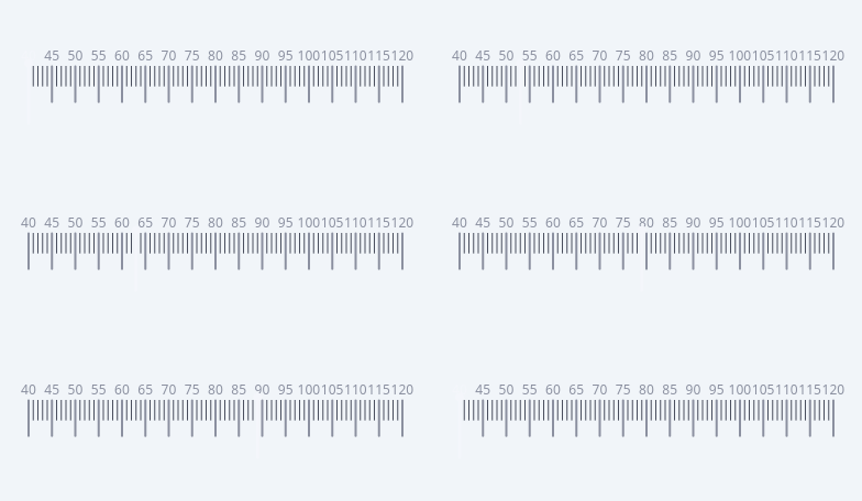
A numbered tick-ruler value selector.
A measurement-style ruler (the weight / height "55 … 65 … 90" picker): a strip
of minor ticks with taller MAJOR ticks + numeric labels, and an indicator at
the current value. Drag or scroll to change the value; it snaps to step.
Two looks (centered):
False (default) - a FIXED ruler: min..max mapped across the width, the
indicator slides to the value (matches the reference weight card).
True - a SCROLLING ruler: the value is pinned under a fixed centre
indicator and the scale scrolls (an iOS-style picker).
Horizontal or vertical (orientation). Painted with QPainter; the strip FLEXes
to the widget, and an optional big value + unit readout sits above. Colours are
qproperties so they flip with the theme. Signal: valueChanged(float).
At a glance
| Tier | Free (GPLv3) |
| Import | from Custom_Widgets.QCustomRulerPicker import QCustomRulerPicker |
| Qt Designer | Yes — drag it from the palette |
Quick start
from Custom_Widgets.QCustomRulerPicker import QCustomRulerPicker

widget = QCustomRulerPicker()
widget.setRange(40.0, 120.0)
widget.setUnit("kg")
widget.setValue(72.5)                      # clamps to the range, so set it after
That is the exact code behind the screenshot above.
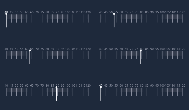
Dark theme
Colours come from the design tokens, so the widget follows the app theme with no extra work.
Properties
Every property below is settable in code and in Qt Designer.
| Property | Type | Default |
|---|---|---|
value | float | 65.0 |
orientation | enum: horizontal/vertical`` | horizontal |
minimum | float | 40.0 |
maximum | float | 120.0 |
step | float | 1.0 |
majorEvery | int | 5 |
centered | bool | False |
tickSpacing | float | 9.0 |
snap | bool | True |
unit | string | Kg |
showValue | bool | False |
tickColor | color | #4a4f5e |
majorTickColor | color | #8b90a0 |
indicatorColor | color | #f4f6fb |
labelColor | color | #8b90a0 |
valueColor | color | #f4f6fb |
Signals
| Signal |
|---|
valueChanged(double) |
Methods
| Method | Description |
|---|---|
centered(*args, **kwargs) | Centered. |
indicatorColor(*args, **kwargs) | Indicator color. |
labelColor(*args, **kwargs) | Label color. |
majorEvery(*args, **kwargs) | Major every. |
majorTickColor(*args, **kwargs) | Major tick color. |
maximum(*args, **kwargs) | Maximum. |
minimum(*args, **kwargs) | Minimum. |
orientation(*args, **kwargs) | Orientation. |
setRange(minimum, maximum) | Set the range. |
setUnit(unit) | Set the unit. |
setValue(value) | Set the value. |
showValue(*args, **kwargs) | Show the value. |
snap(*args, **kwargs) | Snap. |
step(*args, **kwargs) | Step. |
tickColor(*args, **kwargs) | Tick color. |
tickSpacing(*args, **kwargs) | Tick spacing. |
unit(*args, **kwargs) | Unit. |
value(*args, **kwargs) | Value. |
valueChanged(...) | Value changed. |
valueColor(*args, **kwargs) | Value color. |
Related
QCustomButtonGroup · QCustomCheckBox · QCustomColorPicker · QCustomComboBox · QCustomDateEdit · QCustomDateRangeEdit · QCustomDateRangePicker · QCustomEmojiPicker