QCustomRangeSlider
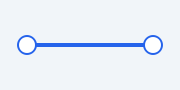
A dual-handle range selector.
Two handles select a [lower, upper] range on a track; the selected span is filled. Drag a handle (or click the track to move the nearest one). Tokenized colours via qproperty. Emits valuesChanged(lower, upper).
At a glance
| Tier | Free (GPLv3) |
| Import | from Custom_Widgets.QCustomRangeSlider import QCustomRangeSlider |
| Qt Designer | Yes — drag it from the palette |
Quick start
from Custom_Widgets.QCustomRangeSlider import QCustomRangeSlider

widget = QCustomRangeSlider()
Dark theme
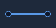
Colours come from the design tokens, so the widget follows the app theme with no extra work.
Properties
Every property below is settable in code and in Qt Designer.
| Property | Type | Default |
|---|---|---|
minimum | int | 0 |
maximum | int | 100 |
lowerValue | int | 0 |
upperValue | int | 100 |
trackColor | color | — |
fillColor | color | — |
handleColor | color | — |
handleBorderColor | color | — |
Signals
| Signal |
|---|
valuesChanged(int,int) |
Methods
| Method | Description |
|---|---|
fillColor(*args, **kwargs) | Fill color. |
handleBorderColor(*args, **kwargs) | Handle border color. |
handleColor(*args, **kwargs) | Handle color. |
lowerValue(*args, **kwargs) | Lower value. |
maximum(*args, **kwargs) | Maximum. |
minimum(*args, **kwargs) | Minimum. |
setLowerValue(v) | Set the lower value. |
setRange(minimum, maximum) | Set the range. |
setUpperValue(v) | Set the upper value. |
setValues(lower, upper) | Set the values. |
trackColor(*args, **kwargs) | Track color. |
upperValue(*args, **kwargs) | Upper value. |
values() | Values. |
valuesChanged(...) | Values changed. |
Theming
Colours come from the design tokens, so they follow the active theme. Roles used: outline, accent, surface.
See Design tokens.
Related
QCustomButtonGroup · QCustomCheckBox · QCustomColorPicker · QCustomComboBox · QCustomDateEdit · QCustomDateRangeEdit · QCustomDateRangePicker · QCustomEmojiPicker