QCustomGradientPicker
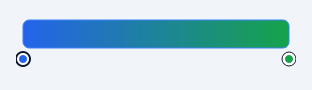
An editable multi-stop gradient control.
A gradient preview with draggable colour stops beneath it. Click the bar to add a stop, drag a handle to move it, double-click a handle to recolour it, Delete to remove it. Qt ships a colour dialog but nothing that edits a gradient, so anything needing one has had to hand-roll it.
Stops are held sorted by position and always number at least two - a "gradient" with one stop is a fill, and allowing it would make every consumer handle a degenerate case that has no reason to exist.
Alpha is preserved throughout and the preview is drawn over a checkerboard, so a translucent stop is visible as translucent rather than silently composited against whatever is behind the widget.
Emits gradientChanged(str) carrying the CSS-ish stop list, and stopSelected(int).
At a glance
| Tier | Free (GPLv3) |
| Import | from Custom_Widgets.QCustomGradientPicker import QCustomGradientPicker |
| Qt Designer | Yes — drag it from the palette |
Quick start
from Custom_Widgets.QCustomGradientPicker import QCustomGradientPicker

widget = QCustomGradientPicker()
Dark theme
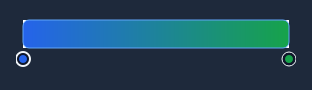
Colours come from the design tokens, so the widget follows the app theme with no extra work.
Properties
Every property below is settable in code and in Qt Designer.
| Property | Type | Default |
|---|---|---|
stopsCsv | string | 0:#2563eb,1:#16a34a |
gradientType | enum: linear/radial`` | linear |
angle | int | 0 |
barHeight | int | 28 |
handleRadius | int | 7 |
readOnly | bool | False |
state | enum: default/error`` | default |
borderColor | color | — |
borderActiveColor | color | — |
borderErrorColor | color | — |
handleColor | color | — |
handleBorderColor | color | — |
Signals
| Signal |
|---|
gradientChanged(QString) |
stopSelected(int) |
Methods
| Method | Description |
|---|---|
addStop(position, colour=None) | Insert a stop. Colour defaults to the gradient's colour there. |
angle(*args, **kwargs) | Angle. |
barHeight(*args, **kwargs) | Bar height. |
borderActiveColor(*args, **kwargs) | Border active color. |
borderColor(*args, **kwargs) | Border color. |
borderErrorColor(*args, **kwargs) | Border error color. |
colorAt(position) | Interpolated colour at a position, matching what the bar paints. |
count() | Count. |
editStopColor(index=None) | Open a colour dialog for a stop. Returns True if it changed. |
gradient(rect=None) | A QGradient over rect (defaults to the preview bar). |
gradientChanged(...) | Gradient changed. |
gradientType(*args, **kwargs) | Gradient type. |
handleAt(point) | Index of the stop handle under a point, or -1. Topmost wins. |
handleBorderColor(*args, **kwargs) | Handle border color. |
handleColor(*args, **kwargs) | Handle color. |
handleRadius(*args, **kwargs) | Handle radius. |
readOnly(*args, **kwargs) | Read only. |
removeStop(index) | Remove a stop. Refuses to go below MIN_STOPS. |
selectedIndex() | Selected index. |
setSelectedIndex(index) | Set the selected index. |
setStopColor(index, colour) | Set the stop color. |
setStopPosition(index, position) | Set the stop position. |
setStops(stops) | Replace every stop. Fewer than two valid stops is rejected. |
state(*args, **kwargs) | State. |
stopColor(index) | Stop the color. |
stopPosition(index) | Stop the position. |
stopSelected(...) | Stop the selected. |
stops() | [(position, QColor), ...] sorted by position. |
stopsCsv(*args, **kwargs) | Stops csv. |
Theming
Colours come from the design tokens, so they follow the active theme. Roles used: surface, on-surface, outline, focus-ring, destructive.
See Design tokens.
Runnable example
A complete app using this widget lives at examples/PySide6/QCustomGradientPicker/main.py.
Related
QCustomButtonGroup · QCustomCheckBox · QCustomColorPicker · QCustomComboBox · QCustomDateEdit · QCustomDateRangeEdit · QCustomDateRangePicker · QCustomEmojiPicker