QCustomMultiSelect
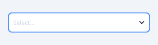
A multiple-choice field with chips.
A closed field that paints the current selection as removable chips, and a checkable popup list to change it. QComboBox cannot do this: it is single-selection by design, and the usual workaround (a QComboBox with checkable model items) leaves the closed field showing one entry while the model holds several.
Options are authored in code with setOptions([...]) or in Qt Designer with the optionsCsv property, following the valuesCsv convention used elsewhere:
optionsCsv = "Red,Green,Blue" labels double as values optionsCsv = "r=Red,g=Green,b=Blue" explicit value=label
Emits selectionChanged(list) and optionToggled(str, bool).
At a glance
| Tier | Free (GPLv3) |
| Import | from Custom_Widgets.QCustomMultiSelect import QCustomMultiSelect |
| Qt Designer | Yes — drag it from the palette |
Quick start
from Custom_Widgets.QCustomMultiSelect import QCustomMultiSelect

widget = QCustomMultiSelect()
Dark theme
Colours come from the design tokens, so the widget follows the app theme with no extra work.

Properties
Every property below is settable in code and in Qt Designer.
| Property | Type | Default |
|---|---|---|
optionsCsv | string | Option one,Option two,Option three |
selectedCsv | string | — |
placeholderText | string | Select... |
maxChips | int | 0 |
maxSelection | int | 0 |
searchable | bool | False |
sizeVariant | enum: sm/md/lg`` | md |
state | enum: default/error`` | default |
fieldBackgroundColor | color | — |
fieldBorderColor | color | — |
fieldBorderActiveColor | color | — |
fieldBorderErrorColor | color | — |
chipBackgroundColor | color | — |
chipTextColor | color | — |
textColor | color | — |
placeholderColor | color | — |
Signals
| Signal |
|---|
optionToggled(QString,bool) |
selectionChanged(QVariantList) |
Methods
| Method | Description |
|---|---|
chipBackgroundColor(*args, **kwargs) | Chip background color. |
chipTextColor(*args, **kwargs) | Chip text color. |
clearSelection() | Clear the selection. |
count() | Count. |
fieldBackgroundColor(*args, **kwargs) | Field background color. |
fieldBorderActiveColor(*args, **kwargs) | Field border active color. |
fieldBorderColor(*args, **kwargs) | Field border color. |
fieldBorderErrorColor(*args, **kwargs) | Field border error color. |
hidePopup() | Hide the popup. |
isPopupVisible() | Return whether the widget is popup visible. |
isSelected(value) | Return whether the widget is selected. |
labelFor(value) | Label for. |
maxChips(*args, **kwargs) | Max chips. |
maxSelection(*args, **kwargs) | Max selection. |
optionToggled(...) | Option toggled. |
options() | Options. |
optionsCsv(*args, **kwargs) | Options csv. |
placeholderColor(*args, **kwargs) | Placeholder color. |
placeholderText(*args, **kwargs) | Placeholder text. |
searchable(*args, **kwargs) | Searchable. |
selectOption(value, on=True) | Select an option. |
selected() | Selected. |
selectedCsv(*args, **kwargs) | Selected csv. |
selectedLabels() | Selected labels. |
selectionChanged(...) | Selection changed. |
setOptions(options) | Replace the option set, dropping any selection that no longer exists. |
setSelected(values) | Set the selected. |
showPopup() | Show the popup. |
sizeVariant(*args, **kwargs) | Size variant. |
state(*args, **kwargs) | State. |
textColor(*args, **kwargs) | Text color. |
toggleOption(value) | Toggle the option. |
Theming
Colours come from the design tokens, so they follow the active theme. Roles used: destructive, focus-ring, on-surface, on-surface-muted, outline, surface, surface-muted.
See Design tokens.
Runnable example
A complete app using this widget lives at examples/PySide6/QCustomMultiSelect/main.py.
Related
QCustomButtonGroup · QCustomCheckBox · QCustomColorPicker · QCustomComboBox · QCustomDateEdit · QCustomDateRangeEdit · QCustomDateRangePicker · QCustomEmojiPicker