QCustomVerificationCode
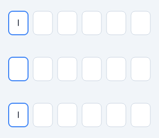
A segmented one-time-code input.
The row of single-character boxes used for 2FA / OTP / email confirmation codes. Painted as one widget rather than assembled from N QLineEdits, so focus, paste and backspace behave as users expect instead of fighting Qt's per-field focus chain.
Behaviour that the naive N-QLineEdit version gets wrong and this does not:
- pasting a whole code fills every box, however it is formatted
- backspace on an empty box steps back and clears the previous one
- arrow keys and Home/End move the caret without destroying input
- only characters permitted by
inputModeare accepted at all
Emits codeChanged(str) on every edit and completed(str) once the last box is filled.
At a glance
| Tier | Free (GPLv3) |
| Import | from Custom_Widgets.QCustomVerificationCode import QCustomVerificationCode |
| Qt Designer | Yes — drag it from the palette |
Quick start
from Custom_Widgets.QCustomVerificationCode import QCustomVerificationCode

widget = QCustomVerificationCode()
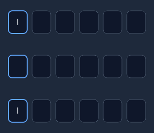
Dark theme
Colours come from the design tokens, so the widget follows the app theme with no extra work.
Properties
Every property below is settable in code and in Qt Designer.
| Property | Type | Default |
|---|---|---|
code | string | — |
digits | int | 6 |
inputMode | enum: numeric/alphanumeric/alpha`` | numeric |
masked | bool | False |
uppercase | bool | True |
separatorAfter | int | 0 |
boxWidth | int | 40 |
boxHeight | int | 48 |
boxSpacing | int | 8 |
state | enum: default/error`` | default |
boxBackgroundColor | color | — |
boxBorderColor | color | — |
boxBorderActiveColor | color | — |
boxBorderErrorColor | color | — |
textColor | color | — |
Signals
| Signal |
|---|
codeChanged(QString) |
completed(QString) |
Methods
| Method | Description |
|---|---|
boxBackgroundColor(*args, **kwargs) | Box background color. |
boxBorderActiveColor(*args, **kwargs) | Box border active color. |
boxBorderColor(*args, **kwargs) | Box border color. |
boxBorderErrorColor(*args, **kwargs) | Box border error color. |
boxHeight(*args, **kwargs) | Box height. |
boxSpacing(*args, **kwargs) | Box spacing. |
boxWidth(*args, **kwargs) | Box width. |
clear() | Clear. |
code(*args, **kwargs) | Code. |
codeChanged(...) | Code changed. |
completed(...) | Completed. |
digits(*args, **kwargs) | Digits. |
inputMode(*args, **kwargs) | Input mode. |
isComplete() | Return whether the widget is complete. |
masked(*args, **kwargs) | Masked. |
pasteFromClipboard() | Fill from the clipboard. Bound to Ctrl+V. |
separatorAfter(*args, **kwargs) | Separator after. |
setCodeText(text) | Fill from a string, ignoring anything the input mode disallows. |
state(*args, **kwargs) | State. |
textColor(*args, **kwargs) | Text color. |
uppercase(*args, **kwargs) | Uppercase. |
Theming
Colours come from the design tokens, so they follow the active theme. Roles used: surface, on-surface, outline, focus-ring, destructive.
See Design tokens.
Runnable example
A complete app using this widget lives at examples/PySide6/QCustomVerificationCode/main.py.
Related
QCustomButtonGroup · QCustomCheckBox · QCustomColorPicker · QCustomComboBox · QCustomDateEdit · QCustomDateRangeEdit · QCustomDateRangePicker · QCustomEmojiPicker