QCustomRadioButton
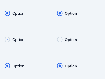
A painted single-choice radio button.
A painted ring with an inner dot that grows in when selected, plus an
optional label. Click or press Space/Enter to select. Unlike QCheckBox a
radio cannot be un-selected by clicking it again - that is the whole point
of the control, so toggle() is deliberately absent.
Auto-exclusive by default: selecting one clears every sibling
QCustomRadioButton that shares its parent, matching QRadioButton. Set
autoExclusive to False when a QCustomRadioGroup (or your own code) owns
the mutual exclusion instead.
Tokenized colours via qproperty; three sizes via sizeVariant (sm/md/lg).
Emits toggled(bool) on every state change and selected(str) carrying the
widget's value when it becomes the chosen option.
At a glance
| Tier | Free (GPLv3) |
| Import | from Custom_Widgets.QCustomRadioButton import QCustomRadioButton |
| Qt Designer | Yes — drag it from the palette |
Quick start
from Custom_Widgets.QCustomRadioButton import QCustomRadioButton

widget = QCustomRadioButton()
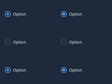
Dark theme
Colours come from the design tokens, so the widget follows the app theme with no extra work.
Properties
Every property below is settable in code and in Qt Designer.
| Property | Type | Default |
|---|---|---|
checked | bool | False |
text | str | — |
value | str | — |
autoExclusive | bool | True |
sizeVariant | enum: sm/md/lg`` | md |
dotScale | float | — |
ringColor | color | — |
ringCheckedColor | color | — |
dotColor | color | — |
textColor | color | — |
Signals
| Signal |
|---|
selected(QString) |
toggled(bool) |
Methods
| Method | Description |
|---|---|
autoExclusive(*args, **kwargs) | Auto exclusive. |
checked(*args, **kwargs) | Checked. |
dotColor(*args, **kwargs) | Dot color. |
dotScale(*args, **kwargs) | Dot scale. |
isChecked() | Return whether the widget is checked. |
ringCheckedColor(*args, **kwargs) | Ring checked color. |
ringColor(*args, **kwargs) | Ring color. |
selected(...) | Selected. |
setChecked(checked) | Set the checked. |
sizeVariant(*args, **kwargs) | Size variant. |
text(*args, **kwargs) | Text. |
textColor(*args, **kwargs) | Text color. |
toggled(...) | Toggled. |
value(*args, **kwargs) | Value. |
Theming
Colours come from the design tokens, so they follow the active theme. Roles used: accent, outline, on-surface.
See Design tokens.
Runnable example
A complete app using this widget lives at examples/PySide6/QCustomRadioButton/main.py.
Related
QCustomButtonGroup · QCustomCheckBox · QCustomColorPicker · QCustomComboBox · QCustomDateEdit · QCustomDateRangeEdit · QCustomDateRangePicker · QCustomEmojiPicker