QCustomMediaGrid
QCustomMediaGrid ships in Custom Widgets Pro. It is not part of the free GPLv3 package from 2.6.0 onward — the free package keeps the import path so Qt Designer forms still load, and installing Pro activates the widget with no code change. Releases up to 2.5.0 included it under the GPLv3.
Pro is licensed software and is not installable from PyPI — the name there is a pointer package with no widgets in it. Licence holders download the wheel from their account:
# https://portal.customwidgets.org/downloads
pip install <the downloaded .whl>
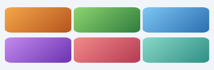
A data-driven thumbnail gallery.
The "Media, Files & Links" photo grid: a responsive grid of rounded
thumbnails. Feed it images with setImages([...]) (QPixmap / path) or coloured
placeholders with setPlaceholders([(top,bottom), …]); it lays them out in
columns with rounded corners and emits tileClicked(index) so a manager
can open a viewer. Layout, corner radius and spacing are Designer
qproperties — the manager supplies DATA only, never builds tiles.
At a glance
| Tier | Pro |
| Import | from Custom_Widgets.QCustomMediaGrid import QCustomMediaGrid |
| Qt Designer | Yes — drag it from the palette |
Quick start
from Custom_Widgets.QCustomMediaGrid import QCustomMediaGrid

widget = QCustomMediaGrid()
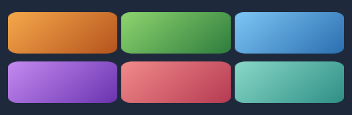
Dark theme
Colours come from the design tokens, so the widget follows the app theme with no extra work.
Properties
Every property below is settable in code and in Qt Designer.
| Property | Type | Default |
|---|---|---|
columns | int | 3 |
spacing | int | 8 |
tileRadius | int | 12 |
tileHeight | int | 60 |
Signals
| Signal |
|---|
tileClicked(int) |
Methods
| Method | Description |
|---|---|
columns(*args, **kwargs) | Columns. |
count() | Count. |
pixmaps() | The current tile pixmaps (for feeding a lightbox / viewer). |
setImageAt(index, pm) | Swap one tile's pixmap in place (e.g. a real photo arriving async). |
setImages(images) | Set the images. |
setPlaceholders(pairs) | Set the placeholders. |
spacing(*args, **kwargs) | Spacing. |
tileClicked(...) | Tile clicked. |
tileHeight(*args, **kwargs) | Tile height. |
tileRadius(*args, **kwargs) | Tile radius. |
Related
QCustomCoverFlow · QCustomImageViewer · QCustomMediaTimeline · QCustomPlayerBar · QCustomVideoPlayer · QCustomVoiceMessage · QCustomWallpaper