QCustomWaveform
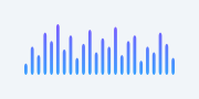
A standalone audio-bars / streaming-line visualiser.
Two modes (mode):
"bars" (default) - an equalizer / audio-level bar viz (the "Water" card):
one rounded bar per value, optional centre mirror (grows up + down),
gradient + optional glow.
"line" - a streaming line viz (the "110 bpm" ECG card): a polyline over an
optional faint grid, with an optional gradient fill under it.
Feed it a fixed series with setValues([...]) / the valuesCsv property, or
stream live with push(value) (a ring buffer of capacity samples scrolls).
Turn on animated for a self-running demo (audio levels / a heartbeat), so it
previews live in Designer / a demo without a data source.
Painted with QPainter; it FLEXes to the widget and all colours are qproperties so they flip with the theme. Unlike QCustomVoiceMessage this is NOT chat-bound.
At a glance
| Tier | Free (GPLv3) |
| Import | from Custom_Widgets.QCustomWaveform import QCustomWaveform |
| Qt Designer | Yes — drag it from the palette |
Quick start
from Custom_Widgets.QCustomWaveform import QCustomWaveform

widget = QCustomWaveform()
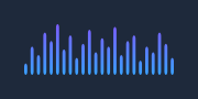
Dark theme
Colours come from the design tokens, so the widget follows the app theme with no extra work.
Properties
Every property below is settable in code and in Qt Designer.
| Property | Type | Default |
|---|---|---|
mode | enum: bars/line`` | bars |
valuesCsv | string | — |
capacity | int | 48 |
barColor | color | #3aa0ff |
barColor2 | color | #7c5cff |
barWidth | float | 0.0 |
barGap | float | 3.0 |
cornerRadius | int | 3 |
mirror | bool | False |
lineColor | color | #ff5c6c |
lineWidth | float | 2.2 |
showGrid | bool | False |
gridColor | color | #242a38 |
fillArea | bool | False |
glow | bool | False |
glowStrength | float | 0.6 |
animated | bool | False |
Signals
| Signal |
|---|
valuePushed(double) |
Methods
| Method | Description |
|---|---|
animated(*args, **kwargs) | Animated. |
barColor(*args, **kwargs) | Bar color. |
barColor2(*args, **kwargs) | Bar color2. |
barGap(*args, **kwargs) | Bar gap. |
barWidth(*args, **kwargs) | Bar width. |
capacity(*args, **kwargs) | Capacity. |
clear() | Clear. |
cornerRadius(*args, **kwargs) | Corner radius. |
fillArea(*args, **kwargs) | Fill area. |
glow(*args, **kwargs) | Glow. |
glowStrength(*args, **kwargs) | Glow strength. |
gridColor(*args, **kwargs) | Grid color. |
lineColor(*args, **kwargs) | Line color. |
lineWidth(*args, **kwargs) | Line width. |
mirror(*args, **kwargs) | Mirror. |
mode(*args, **kwargs) | Mode. |
push(value) | Push. |
setAnimated(on) | Set the animated. |
setMode(mode) | Set the mode. |
setValues(values) | Set the values. |
showGrid(*args, **kwargs) | Show the grid. |
valuePushed(...) | Value pushed. |
values() | Values. |
valuesCsv(*args, **kwargs) | Values csv. |
Related
QCustomAreaChart · QCustomBarChart · QCustomBeeswarm · QCustomBubbleChart · QCustomCandlestickChart · QCustomCompass · QCustomCompassDial · QCustomDivergingBarChart