QCustomCompass
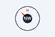
A heading / compass rose.
A painted compass: a tick ring with N / E / S / W (+ intercardinals), a
two-tone needle and a centre readout (16-point cardinal + degrees). Set the
heading (0-360°, 0 = North = up); it eases to the new bearing when animated.
Two looks (rotateBezel):
False (default) - a FIXED rose, the needle rotates to the heading.
True - a rotating COMPASS CARD: the needle stays up and the whole
rose spins so the heading sits at the top (aircraft / marine style).
Interactive: drag around the centre to set the heading (opt-out via
interactive=False). Painted with QPainter; it FLEXes to the widget and every
colour is a qproperty so it flips with the theme. Signal: headingChanged(float).
At a glance
| Tier | Free (GPLv3) |
| Import | from Custom_Widgets.QCustomCompass import QCustomCompass |
| Qt Designer | Yes — drag it from the palette |
Quick start
from Custom_Widgets.QCustomCompass import QCustomCompass

widget = QCustomCompass()
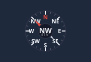
Dark theme
Colours come from the design tokens, so the widget follows the app theme with no extra work.
Properties
Every property below is settable in code and in Qt Designer.
| Property | Type | Default |
|---|---|---|
heading | float | 315.0 |
rotateBezel | bool | False |
showIntercardinals | bool | True |
showReadout | bool | True |
animated | bool | True |
interactive | bool | True |
northColor | color | #e0463c |
southColor | color | #cfd4de |
ringColor | color | #2b3145 |
tickColor | color | #6b7280 |
cardinalColor | color | #f4f6fb |
readoutColor | color | #f4f6fb |
hubColor | color | #141826 |
Signals
| Signal |
|---|
headingChanged(double) |
Methods
| Method | Description |
|---|---|
animated(*args, **kwargs) | Animated. |
cardinal16(deg) | Cardinal16. |
cardinalColor(*args, **kwargs) | Cardinal color. |
heading(*args, **kwargs) | Heading. |
headingChanged(...) | Heading changed. |
hubColor(*args, **kwargs) | Hub color. |
interactive(*args, **kwargs) | Interactive. |
northColor(*args, **kwargs) | North color. |
readoutColor(*args, **kwargs) | Readout color. |
ringColor(*args, **kwargs) | Ring color. |
rotateBezel(*args, **kwargs) | Rotate bezel. |
setHeading(deg) | Set the heading. |
showIntercardinals(*args, **kwargs) | Show the intercardinals. |
showReadout(*args, **kwargs) | Show the readout. |
southColor(*args, **kwargs) | South color. |
tickColor(*args, **kwargs) | Tick color. |
Related
QCustomAreaChart · QCustomBarChart · QCustomBeeswarm · QCustomBubbleChart · QCustomCandlestickChart · QCustomCompassDial · QCustomDivergingBarChart · QCustomDonut