QCustomCandlestickChart
QCustomCandlestickChart ships in Custom Widgets Pro. It is not part of the free GPLv3 package from 2.6.0 onward — the free package keeps the import path so Qt Designer forms still load, and installing Pro activates the widget with no code change. Releases up to 2.5.0 included it under the GPLv3.
Pro is licensed software and is not installable from PyPI — the name there is a pointer package with no widgets in it. Licence holders download the wheel from their account:
# https://portal.customwidgets.org/downloads
pip install <the downloaded .whl>
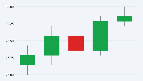
A painted OHLC / candlestick price chart.
Each candle is one period: a filled body spanning open->close and a wick spanning low->high. Candles are coloured by direction - up when close >= open, down otherwise - which is the whole point of the form.
Rendered entirely with QPainter and NO QtCharts dependency. That is deliberate and load-bearing: Qt Charts is GPLv3-or-commercial with no LGPL option, so anything built on it cannot ship inside a proprietary wheel. This widget stays clean.
Data goes in with setData([(open, high, low, close), ...]) in code, or the ohlcCsv property in Qt Designer ("o,h,l,c;o,h,l,c;..."), following the valuesCsv convention used by the other painted charts.
Emits candleHovered(int) and candleClicked(int); -1 means "nothing".
At a glance
| Tier | Pro |
| Import | from Custom_Widgets.QCustomCandlestickChart import QCustomCandlestickChart |
| Qt Designer | Yes — drag it from the palette |
Quick start
from Custom_Widgets.QCustomCandlestickChart import QCustomCandlestickChart

widget = QCustomCandlestickChart()
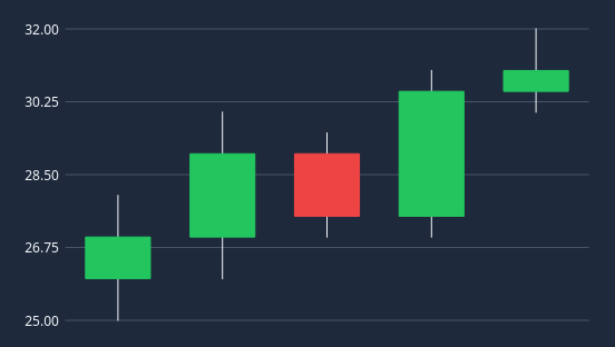
Dark theme
Colours come from the design tokens, so the widget follows the app theme with no extra work.
Properties
Every property below is settable in code and in Qt Designer.
| Property | Type | Default |
|---|---|---|
ohlcCsv | string | — |
labelsCsv | string | — |
showGrid | bool | True |
showPriceAxis | bool | True |
showLabels | bool | True |
showTooltip | bool | True |
hollowUpCandles | bool | False |
candleWidthRatio | float | 0.62 |
gridLines | int | 4 |
pricePrecision | int | 2 |
upColor | color | #16a34a |
downColor | color | #dc2626 |
wickColor | color | #64748b |
gridColor | color | #e2e8f0 |
axisTextColor | color | #64748b |
tooltipBackgroundColor | color | — |
tooltipTextColor | color | — |
Signals
| Signal |
|---|
candleClicked(int) |
candleHovered(int) |
Methods
| Method | Description |
|---|---|
axisTextColor(*args, **kwargs) | Axis text color. |
candleAt(pos) | Index of the candle under a point, or -1. |
candleClicked(...) | Candle clicked. |
candleHovered(...) | Candle hovered. |
candleWidthRatio(*args, **kwargs) | Candle width ratio. |
count() | Count. |
data() | Data. |
downColor(*args, **kwargs) | Down color. |
gridColor(*args, **kwargs) | Grid color. |
gridLines(*args, **kwargs) | Grid lines. |
hollowUpCandles(*args, **kwargs) | Hollow up candles. |
labels() | Labels. |
labelsCsv(*args, **kwargs) | Labels csv. |
ohlcCsv(*args, **kwargs) | Ohlc csv. |
pricePrecision(*args, **kwargs) | Price precision. |
priceRange() | (low, high) across every candle, or (0.0, 1.0) when empty. |
setData(data, labels=None) | Replace every candle. Each item is (open, high, low, close). |
setLabels(labels) | Set the labels. |
showGrid(*args, **kwargs) | Show the grid. |
showLabels(*args, **kwargs) | Show the labels. |
showPriceAxis(*args, **kwargs) | Show the price axis. |
showTooltip(*args, **kwargs) | Show the tooltip. |
tooltipBackgroundColor(*args, **kwargs) | Tooltip background color. |
tooltipTextColor(*args, **kwargs) | Tooltip text color. |
upColor(*args, **kwargs) | Up color. |
wickColor(*args, **kwargs) | Wick color. |
Theming
Colours come from the design tokens, so they follow the active theme. Roles used: success, destructive, outline, on-surface.
See Design tokens.
Related
QCustomAreaChart · QCustomBarChart · QCustomBeeswarm · QCustomBubbleChart · QCustomCompass · QCustomCompassDial · QCustomDivergingBarChart · QCustomDonut