QCustomGanttChart
QCustomGanttChart ships in Custom Widgets Pro. It is not part of the free GPLv3 package from 2.6.0 onward — the free package keeps the import path so Qt Designer forms still load, and installing Pro activates the widget with no code change. Releases up to 2.5.0 included it under the GPLv3.
Pro is licensed software and is not installable from PyPI — the name there is a pointer package with no widgets in it. Licence holders download the wheel from their account:
# https://portal.customwidgets.org/downloads
pip install <the downloaded .whl>
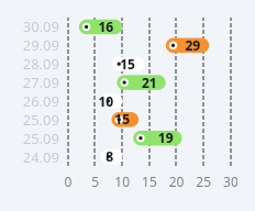
A horizontal timeline / gantt of rounded pill bars.
Every ROW is one rounded "pill" bar placed on a shared numeric x-axis by
its start and length; the row LABEL (e.g. a date) sits on the left,
the row VALUE is printed at the right end of the bar, and an optional
leading circular ICON (a QPixmap clipped to a circle) or coloured dot marks
the bar's start. Bars are coloured by CATEGORY (colorsCsv). A light x-grid
with tick labels runs underneath. This is the "projects timeline" viz.
Painted (no QtCharts) so it is crisp and self-contained.
Give rows in code with setData([...]) — each row a dict
{"label","start","length","category","value","icon"} (icon = a path or
QPixmap, optional) — or in Qt Designer with dataCsv (rows by ';', fields
"label,start,length,category,value"). xMax/gridStep set the axis;
colours are qproperties so a theme flips them on switch.
At a glance
| Tier | Pro |
| Import | from Custom_Widgets.QCustomGanttChart import QCustomGanttChart |
| Qt Designer | Yes — drag it from the palette |
Quick start
from Custom_Widgets.QCustomGanttChart import QCustomGanttChart

widget = QCustomGanttChart()
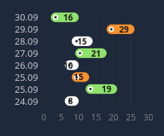
Dark theme
Colours come from the design tokens, so the widget follows the app theme with no extra work.
Properties
Every property below is settable in code and in Qt Designer.
| Property | Type | Default |
|---|---|---|
dataCsv | string | — |
colorsCsv | string | #8fe36b,#f6912b,#ffffff |
textColorsCsv | string | #1c1c20,#1c1c20,#1c1c20 |
xMax | float | 30.0 |
gridStep | float | 5.0 |
barHeight | int | 30 |
labelColor | color | #c7c9cf |
axisTextColor | color | #7d7f88 |
gridColor | color | #2f2f35 |
showGrid | bool | True |
showMarkers | bool | True |
Methods
| Method | Description |
|---|---|
axisTextColor(*args, **kwargs) | Axis text color. |
barHeight(*args, **kwargs) | Bar height. |
colorsCsv(*args, **kwargs) | Colors csv. |
data() | Data. |
dataCsv(*args, **kwargs) | Data csv. |
gridColor(*args, **kwargs) | Grid color. |
gridStep(*args, **kwargs) | Grid step. |
labelColor(*args, **kwargs) | Label color. |
setColors(fills, texts=None) | Set the colors. |
setData(rows) | Set the data. |
showGrid(*args, **kwargs) | Show the grid. |
showMarkers(*args, **kwargs) | Show the markers. |
textColorsCsv(*args, **kwargs) | Text colors csv. |
xMax(*args, **kwargs) | X max. |
Related
QCustomAreaChart · QCustomBarChart · QCustomBeeswarm · QCustomBubbleChart · QCustomCandlestickChart · QCustomCompass · QCustomCompassDial · QCustomDivergingBarChart