QCustomDotMatrix
QCustomDotMatrix ships in Custom Widgets Pro. It is not part of the free GPLv3 package from 2.6.0 onward — the free package keeps the import path so Qt Designer forms still load, and installing Pro activates the widget with no code change. Releases up to 2.5.0 included it under the GPLv3.
Pro is licensed software and is not installable from PyPI — the name there is a pointer package with no widgets in it. Licence holders download the wheel from their account:
# https://portal.customwidgets.org/downloads
pip install <the downloaded .whl>
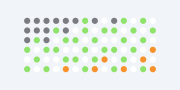
A density / category dot grid.
A grid of small dots where each cell carries a STATE (0..N). State 0 is
the "empty" slot (drawn faintly with emptyColor); states 1..N pick a
colour from colorsCsv. Use it for the dot-matrix density panels seen on
modern dashboards (e.g. a "product" activity grid: valid / invalid / idle
dots that thicken toward one corner). Painted (no QtCharts) so it is crisp
at any size and needs no legend/toolbar.
Give the grid in code with setData([[0,1,2,...], ...]) (row-major 2-D list
of state ints), or in Qt Designer with the dataCsv property (rows joined
by ';', cells by ','). rows/cols size an empty grid. Colours are
qproperties so a theme/manager can tokenise them and they flip on theme
switch.
At a glance
| Tier | Pro |
| Import | from Custom_Widgets.QCustomDotMatrix import QCustomDotMatrix |
| Qt Designer | Yes — drag it from the palette |
Quick start
from Custom_Widgets.QCustomDotMatrix import QCustomDotMatrix

widget = QCustomDotMatrix()
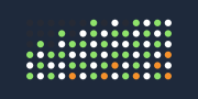
Dark theme
Colours come from the design tokens, so the widget follows the app theme with no extra work.
Properties
Every property below is settable in code and in Qt Designer.
| Property | Type | Default |
|---|---|---|
dataCsv | string | — |
rows | int | 6 |
cols | int | 14 |
colorsCsv | string | #8fe36b,#ffffff,#f6912b |
emptyColor | color | #2c2c30 |
dotDiameter | int | 0 |
gapRatio | float | 0.55 |
emptyOpacity | float | 0.6 |
square | bool | False |
Methods
| Method | Description |
|---|---|
colorsCsv(*args, **kwargs) | Colors csv. |
cols(*args, **kwargs) | Cols. |
data() | Data. |
dataCsv(*args, **kwargs) | Data csv. |
dotDiameter(*args, **kwargs) | Dot diameter. |
emptyColor(*args, **kwargs) | Empty color. |
emptyOpacity(*args, **kwargs) | Empty opacity. |
gapRatio(*args, **kwargs) | Gap ratio. |
rows(*args, **kwargs) | Rows. |
setColors(colors) | Set the colors. |
setData(data) | 2-D row-major list of state ints (0 = empty, 1..N = colour index). |
square(*args, **kwargs) | Square. |
Related
QCustomAreaChart · QCustomBarChart · QCustomBeeswarm · QCustomBubbleChart · QCustomCandlestickChart · QCustomCompass · QCustomCompassDial · QCustomDivergingBarChart