QCustomBarChart
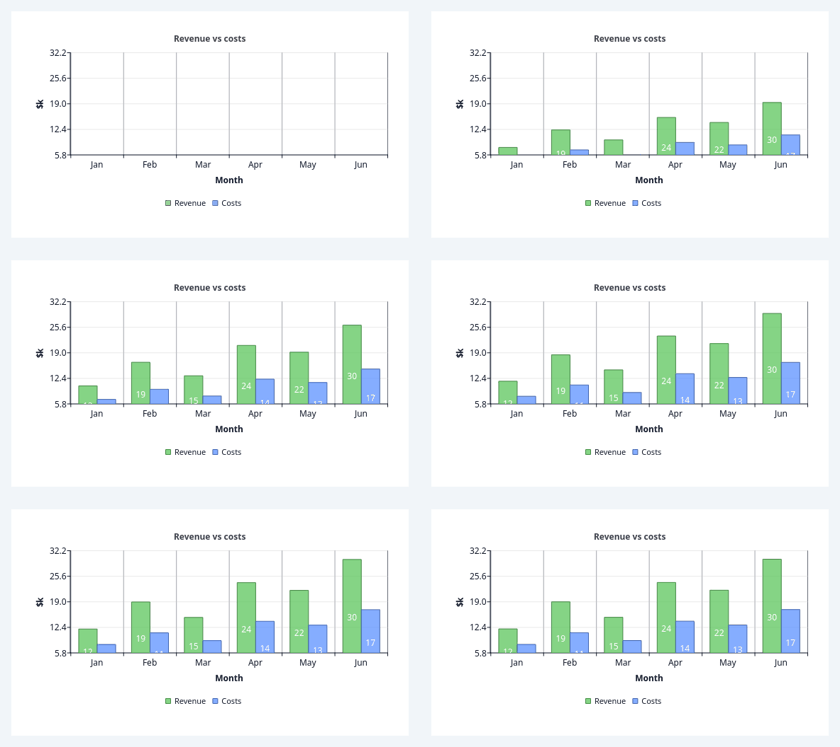
Bar chart implementation using the modular architecture.
Qt Designer compatible with property exposure.
At a glance
| Tier | Free (GPLv3) |
| Import | from Custom_Widgets.QCustomCharts.QCustomBarChart import QCustomBarChart |
| Qt Designer | Yes — drag it from the palette |
Quick start
from Custom_Widgets.QCustomCharts.QCustomBarChart import QCustomBarChart

widget = QCustomBarChart()
widget.categoriesCsv = "Jan,Feb,Mar,Apr,May,Jun"
widget.seriesCsv = "Revenue=12,19,15,24,22,30;Costs=8,11,9,14,13,17"
_chartPresentation(w, theme, "Revenue vs costs", "Month", "$k")
That is the exact code behind the screenshot above.
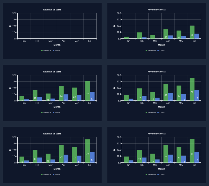
Dark theme
Colours come from the design tokens, so the widget follows the app theme with no extra work.
Properties
Every property below is settable in code and in Qt Designer.
| Property | Type | Default |
|---|---|---|
showGrid | bool | True |
gridColor | color | #c8c8c8 |
showLegend | bool | True |
barWidth | float | 0.7 |
stacked | bool | False |
showValueLabels | bool | True |
valueLabelsFormat | string | {:.1f} |
labelsPosition | int | 0 |
xAxisTitle | string | Categories |
yAxisTitle | string | Values |
autoScale | bool | True |
showCrosshair | bool | True |
crosshairColor | color | #000000 |
crosshairWidth | float | 1.0 |
chartTitle | string | Bar Chart |
animationEnabled | bool | True |
animationDuration | int | 1000 |
antialiasing | bool | True |
showToolbar | bool | False |
tooltipsEnabled | bool | True |
tooltipDelay | int | 500 |
tooltipDuration | int | 5000 |
theme | int | 0 |
legendPosition | int | 1 |
legendFontSize | int | 8 |
legendBackgroundVisible | bool | False |
compactMode | bool | False |
seriesCsv | string | — |
categoriesCsv | string | — |
Signals
| Signal |
|---|
barClicked(QString,double,QString) |
barHovered(QString,double,QString) |
chartExportComplete(QString,bool) |
legendPositionChanged(QString) |
seriesAdded(QString) |
seriesRemoved(QString) |
Methods
| Method | Description |
|---|---|
| `addSeries(name: str, values: List[float], categories: List[str] | None = None, color: PySide6.QtGui.QColor |
appendToSeries(name: str, values: List[float]) -> bool | Append values to an existing series |
applyCustomPalette(palette: PySide6.QtGui.QPalette) | Apply a custom palette to the chart (for App Theme) |
barClicked(...) | Bar clicked. |
barHovered(...) | Bar hovered. |
barWidth(*args, **kwargs) | Get bar width |
chartExportComplete(...) | Chart export complete. |
clearBarColors(series_name: str = None) | Clear the bar colors. |
clearData() | Clear all chart data (compatibility method) |
clearHighlight(series_name: str = None) | Clear the highlight. |
exportToClipboard() | Export chart to clipboard |
exportToFile(format: str = None, filename: str = None) | Export chart to file |
generateExampleData(example_type: str = 'simple') | Generate example bar chart data for testing. |
getAvailableLegendPositions() -> List[str] | Get list of available legend positions |
getAvailableThemes() -> List[str] | Get list of available theme names |
getBarCornerRadius() -> int | Return the bar corner radius. |
| `getBarSet(series_name: str) -> PySide6.QtCharts.QBarSet | None` |
getBarWidth() -> float | Get current bar width |
getCategories() -> List[str] | Get the current category names |
getLabelsPosition() -> str | Get current labels position |
getLegendAlignment() -> PySide6.QtCore.Qt.AlignmentFlag | Get current legend alignment |
getLegendFontSize() -> int | Get legend font size |
getSeriesData(name: str) -> List[Tuple[float, float]] | Get data for a specific series (overrides base method) |
getSeriesNames() -> List[str] | Get list of all series names (overrides base method) |
getShowValueLabels() -> bool | Check if value labels are shown |
getValueLabelsFormat() -> str | Get value labels format string |
getYAxisRange() -> Tuple[float, float] | Get Y axis range |
gridColor(*args, **kwargs) | Get grid color |
hideCrosshair() | Manually hide crosshair |
hideTooltip() | Manually hide tooltip |
highlightBar(category: str, series_name: str, highlight: bool = True) | Highlight a specific bar |
highlightIndex(index: int, color=None, series_name: str = None) | Accent a single bar (by category index). color defaults to a |
isStacked() -> bool | Check if bars are stacked |
labelsPosition(*args, **kwargs) | Bar labels position (int; see QCustomChartEnums.BarLabelsPosition). |
legendPositionChanged(...) | Legend position changed. |
printChart() | Print chart |
refreshTheme() | Refresh the current theme (useful when app palette changes) |
removeSeries(name: str) -> bool | Remove a series from the chart |
seriesAdded(...) | Series added. |
seriesRemoved(...) | Series removed. |
setBarColors(colors, series_name: str = None) | Give each bar its own colour. colors is a list parallel to the |
setBarCornerRadius(radius: int) | Round the top corners of bars (px). 0 restores native square bars. |
setBarWidth(width: float) | Set relative bar width (0.0 to 1.0) |
setCategories(categories: List[str]) | Set the category names for the X axis |
setChartTitle(title: str) | Set chart title (compatibility method) |
setCrosshairColor(color: PySide6.QtGui.QColor) | Set crosshair line color |
setCrosshairStyle(style: PySide6.QtCore.Qt.PenStyle) | Set crosshair line style |
setCrosshairWidth(width: float) | Set crosshair line width |
setGridLineAlpha(alpha: int) | Set just the grid line opacity (0-255), keeping the current hue. |
| `setGridLineColor(color, alpha: int | None = None)` |
setLabelsPosition(position: str) | Set position of value labels |
setLegendAlignment(alignment: PySide6.QtCore.Qt.AlignmentFlag) | Directly set legend alignment |
setLegendBackgroundVisible(visible: bool) | Set legend background visibility |
setLegendFontSize(size: int) | Set legend font size |
setSeriesColor(name: str, color: PySide6.QtGui.QColor) | Set color for a specific series (overrides base method) |
setSeriesVisibility(name: str, visible: bool) | Set visibility for a specific series (overrides base method) |
setShowValueLabels(show: bool) | Set whether value labels are shown on bars |
setStacked(stacked: bool) | Set whether bars are stacked |
setValueLabelsFormat(format_str: str) | Set format string for value labels |
setXAxisTitle(title: str) | Set X axis title |
setYAxisRange(min_val: float, max_val: float) | Set Y axis range |
setYAxisTitle(title: str) | Set Y axis title |
showCrosshairAt(x: float, y: float) | Manually show crosshair at specific coordinates |
showGrid(*args, **kwargs) | Get grid visibility |
showLegend(*args, **kwargs) | Get legend visibility |
showTooltipAt(x: float, y: float, series_name: str, title: str = None, description: str = None) | Manually show tooltip at specific coordinates |
showValueLabels(*args, **kwargs) | Get value labels visibility |
stacked(*args, **kwargs) | Get stacked state |
updateChart() | Update the chart display based on current data |
updateSeriesData(name: str, values: List[float]) -> bool | Update data for an existing series |
valueLabelsFormat(*args, **kwargs) | Get value labels format |
Theming
Colours come from the design tokens, so they follow the active theme. Roles used: surface, on-surface, accent.
See Design tokens.
Related
QCustomAreaChart · QCustomBeeswarm · QCustomBubbleChart · QCustomCandlestickChart · QCustomCompass · QCustomCompassDial · QCustomDivergingBarChart · QCustomDonut