QCustomBeeswarm
QCustomBeeswarm ships in Custom Widgets Pro. It is not part of the free GPLv3 package from 2.6.0 onward — the free package keeps the import path so Qt Designer forms still load, and installing Pro activates the widget with no code change. Releases up to 2.5.0 included it under the GPLv3.
Pro is licensed software and is not installable from PyPI — the name there is a pointer package with no widgets in it. Licence holders download the wheel from their account:
# https://portal.customwidgets.org/downloads
pip install <the downloaded .whl>
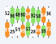
A column beeswarm / bubble-stack chart.
Each COLUMN is a thin vertical guide line carrying a vertical stack of
rounded "pill" bubbles. Every bubble shows a VALUE (its number) and a
CATEGORY (a colour from colorsCsv); the pill's height scales with the
value between minSize..maxSize. This is the "check-box product" viz:
numbered capsules in columns, coloured by Resources / Valid / Invalid.
Painted (no QtCharts) so it stays crisp and needs no external axis.
Give data in code with setData(columns) where columns is a list of
columns and each column is a list of (value, category) pairs, or in Qt
Designer with dataCsv (columns separated by ';', items by ',', each item
"value:category" — category is the 1-based colour index, default 1).
Colours / the number-text colour rules are qproperties so a theme flips
them on switch. The legend + total are best drawn as sibling labels in the
card (reuse), not by this widget.
At a glance
| Tier | Pro |
| Import | from Custom_Widgets.QCustomBeeswarm import QCustomBeeswarm |
| Qt Designer | Yes — drag it from the palette |
Quick start
from Custom_Widgets.QCustomBeeswarm import QCustomBeeswarm

widget = QCustomBeeswarm()
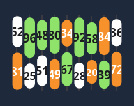
Dark theme
Colours come from the design tokens, so the widget follows the app theme with no extra work.
Properties
Every property below is settable in code and in Qt Designer.
| Property | Type | Default |
|---|---|---|
dataCsv | string | — |
colorsCsv | string | #ffffff,#8fe36b,#f6912b |
textColorsCsv | string | #1c1c20,#1c1c20,#ffffff |
lineColor | color | #3a3a40 |
minSize | int | 34 |
maxSize | int | 58 |
bubbleWidth | int | 42 |
gap | int | 8 |
showValues | bool | True |
jitter | int | 0 |
Methods
| Method | Description |
|---|---|
bubbleWidth(*args, **kwargs) | Bubble width. |
colorsCsv(*args, **kwargs) | Colors csv. |
data() | Data. |
dataCsv(*args, **kwargs) | Data csv. |
gap(*args, **kwargs) | Gap. |
jitter(*args, **kwargs) | Jitter. |
lineColor(*args, **kwargs) | Line color. |
maxSize(*args, **kwargs) | Max size. |
minSize(*args, **kwargs) | Min size. |
setColors(fills, texts=None) | Set the colors. |
setData(columns) | columns = list of columns; each column = list of (value, category). |
showValues(*args, **kwargs) | Show the values. |
textColorsCsv(*args, **kwargs) | Text colors csv. |
Related
QCustomAreaChart · QCustomBarChart · QCustomBubbleChart · QCustomCandlestickChart · QCustomCompass · QCustomCompassDial · QCustomDivergingBarChart · QCustomDonut