QCustomRadialLines
QCustomRadialLines ships in Custom Widgets Pro. It is not part of the free GPLv3 package from 2.6.0 onward — the free package keeps the import path so Qt Designer forms still load, and installing Pro activates the widget with no code change. Releases up to 2.5.0 included it under the GPLv3.
Pro is licensed software and is not installable from PyPI — the name there is a pointer package with no widgets in it. Licence holders download the wheel from their account:
# https://portal.customwidgets.org/downloads
pip install <the downloaded .whl>
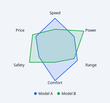
A painted polar line chart.
A line chart wrapped onto a circle: the x axis is angular, so the series closes back on itself. The right form for cyclical data - hours of a day, months of a year, compass bearings - where a cartesian line chart puts an artificial break between the last point and the first.
Distinct from QCustomRadarChart: radar compares a handful of NAMED axes as a shape; this plots a continuous series around a circle and does not label every sample.
QPainter only, NO QtCharts (see docs/design/mui-charts-gap.md). Angles come from the shared _chart_axis polar helpers so it winds the same way as the other radial charts.
Data goes in with addSeries(name, values) in code, or seriesCsv in Qt Designer:
seriesCsv = "Weekday=30,45,60,52,48,70,64;Weekend=20,25,40,38,30,35,28"
Emits seriesHovered(int) and pointClicked(int, int); -1 means "nothing".
At a glance
| Tier | Pro |
| Import | from Custom_Widgets.QCustomRadialLines import QCustomRadialLines |
| Qt Designer | Yes — drag it from the palette |
Quick start
from Custom_Widgets.QCustomRadialLines import QCustomRadialLines

widget = QCustomRadialLines()
widget.setLabels(["Speed", "Power", "Range", "Comfort", "Safety", "Price"])
widget.setSeries([("Model A", [8, 6, 7, 9, 5, 6]),
         ("Model B", [5, 9, 6, 4, 8, 7])])
That is the exact code behind the screenshot above.
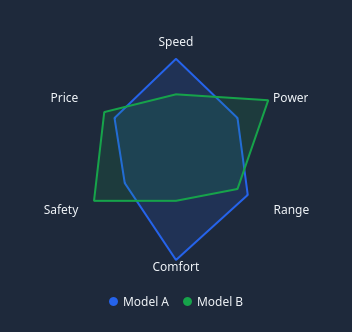
Dark theme
Colours come from the design tokens, so the widget follows the app theme with no extra work.
Properties
Every property below is settable in code and in Qt Designer.
| Property | Type | Default |
|---|---|---|
seriesCsv | string | — |
labelsCsv | string | — |
colorsCsv | string | — |
maxValue | float | 0.0 |
startAngle | int | 90 |
clockwise | bool | True |
rings | int | 4 |
lineWidth | float | 2.0 |
fillOpacity | float | 0.15 |
closed | bool | True |
smooth | bool | False |
showGrid | bool | True |
showMarkers | bool | False |
showLabels | bool | True |
showLegend | bool | True |
gridColor | color | #e2e8f0 |
labelColor | color | #64748b |
Signals
| Signal |
|---|
pointClicked(int,int) |
seriesHovered(int) |
Methods
| Method | Description |
|---|---|
addSeries(name, values, color=None) | Add a series. |
clearSeries() | Clear the series. |
clockwise(*args, **kwargs) | Clockwise. |
closed(*args, **kwargs) | Closed. |
colorsCsv(*args, **kwargs) | Colors csv. |
fillOpacity(*args, **kwargs) | Fill opacity. |
gridColor(*args, **kwargs) | Grid color. |
labelColor(*args, **kwargs) | Label color. |
labels() | Labels. |
labelsCsv(*args, **kwargs) | Labels csv. |
lineWidth(*args, **kwargs) | Line width. |
maxValue(*args, **kwargs) | Max value. |
maximum() | Maximum. |
pointClicked(...) | Point clicked. |
pointFor(seriesIndex, sampleIndex) | Widget-space point for one sample of one series. |
rings(*args, **kwargs) | Rings. |
sampleAt(pos) | (series, sample) nearest a point, or (-1, -1). |
sampleCount() | Samples around the circle — the longest series wins. |
series() | Series. |
seriesAt(pos) | Index of the series whose closed shape contains a point, else -1. |
seriesColor(index) | Series color. |
seriesCount() | Series count. |
seriesCsv(*args, **kwargs) | Series csv. |
seriesHovered(...) | Series hovered. |
setLabels(labels) | Set the labels. |
setSeries(series) | Set the series. |
showGrid(*args, **kwargs) | Show the grid. |
showLabels(*args, **kwargs) | Show the labels. |
showLegend(*args, **kwargs) | Show the legend. |
showMarkers(*args, **kwargs) | Show the markers. |
smooth(*args, **kwargs) | Smooth. |
startAngle(*args, **kwargs) | Start the angle. |
Theming
Colours come from the design tokens, so they follow the active theme. Roles used: surface-muted, on-surface.
See Design tokens.
Related
QCustomAreaChart · QCustomBarChart · QCustomBeeswarm · QCustomBubbleChart · QCustomCandlestickChart · QCustomCompass · QCustomCompassDial · QCustomDivergingBarChart