QCustomHeatmap
QCustomHeatmap ships in Custom Widgets Pro. It is not part of the free GPLv3 package from 2.6.0 onward — the free package keeps the import path so Qt Designer forms still load, and installing Pro activates the widget with no code change. Releases up to 2.5.0 included it under the GPLv3.
Pro is licensed software and is not installable from PyPI — the name there is a pointer package with no widgets in it. Licence holders download the wheel from their account:
# https://portal.customwidgets.org/downloads
pip install <the downloaded .whl>
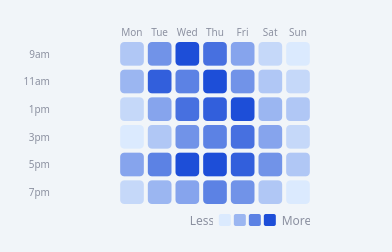
A painted colour-intensity grid.
Two modes (mode):
"grid" (default) - a rows x cols matrix (e.g. hours x weekdays, the
"Activity by time" heatmap): each cell's colour is its value mapped on a
low->high ramp, with row/col labels and an optional Less->More legend.
"calendar" - a GitHub-style contributions calendar: a flat list of daily
values wrapped into 7 rows (weekdays) x N columns (weeks).
Values come in via setValues(list[list[float]]) / a flat list (calendar), or
the valuesCsv Designer property (rows separated by ';', cells by ','). Cells
auto-normalise across the data (min->max) unless you setRange(...). Painted
with QPainter so it stays crisp at any size; the grid FLEX-fits the box left
after labels + legend, so nothing clips when the widget grows or shrinks.
Signals: cellClicked(row, col, value); a per-cell tooltip on hover.
At a glance
| Tier | Pro |
| Import | from Custom_Widgets.QCustomHeatmap import QCustomHeatmap |
| Qt Designer | Yes — drag it from the palette |
Quick start
from Custom_Widgets.QCustomHeatmap import QCustomHeatmap

widget = QCustomHeatmap()
widget.setMode("grid")
widget.setValues([[2, 5, 9, 7, 4, 1, 0], [3, 8, 6, 9, 5, 2, 1],
         [1, 4, 7, 8, 9, 3, 2], [0, 2, 5, 6, 7, 4, 1],
         [4, 6, 9, 9, 8, 5, 2], [1, 3, 4, 6, 5, 2, 0]])
widget.setLabels(row_labels=["9am", "11am", "1pm", "3pm", "5pm", "7pm"],
        col_labels=["Mon", "Tue", "Wed", "Thu", "Fri", "Sat", "Sun"])
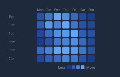
widget.setColors("#1e3a8a", "#60a5fa", "#1e293b")
else:
widget.setColors("#dbeafe", "#1d4ed8", "#f1f5f9")
That is the exact code behind the screenshot above.
Dark theme
Colours come from the design tokens, so the widget follows the app theme with no extra work.
Properties
Every property below is settable in code and in Qt Designer.
| Property | Type | Default |
|---|---|---|
mode | enum: grid/calendar`` | grid |
valuesCsv | string | — |
rowLabelsCsv | string | — |
colLabelsCsv | string | — |
lowColor | color | #1e1b3a |
highColor | color | #b3a4ff |
emptyColor | color | #17152b |
cellSize | int | 0 |
cellGap | int | 4 |
cornerRadius | int | 4 |
showLabels | bool | True |
showLegend | bool | True |
labelColor | color | #8b90a0 |
autoNormalize | bool | True |
minValue | float | 0.0 |
maxValue | float | 1.0 |
Signals
| Signal |
|---|
cellClicked(int,int,double) |
Methods
| Method | Description |
|---|---|
autoNormalize(*args, **kwargs) | Auto normalize. |
cellClicked(...) | Cell clicked. |
cellGap(*args, **kwargs) | Cell gap. |
cellSize(*args, **kwargs) | Cell size. |
colLabelsCsv(*args, **kwargs) | Col labels csv. |
cornerRadius(*args, **kwargs) | Corner radius. |
emptyColor(*args, **kwargs) | Empty color. |
highColor(*args, **kwargs) | High color. |
labelColor(*args, **kwargs) | Label color. |
lowColor(*args, **kwargs) | Low color. |
maxValue(*args, **kwargs) | Max value. |
minValue(*args, **kwargs) | Min value. |
mode(*args, **kwargs) | Mode. |
rowLabelsCsv(*args, **kwargs) | Row labels csv. |
setColors(low, high, empty=None) | Set the colors. |
setData(values) | Backward-compatible alias for setValues(). |
setLabels(row_labels=None, col_labels=None) | Set the labels. |
setMode(mode) | Set the mode. |
setRange(minimum, maximum) | Set the range. |
setValues(values) | Set the values. |
showLabels(*args, **kwargs) | Show the labels. |
showLegend(*args, **kwargs) | Show the legend. |
values() | Values. |
valuesCsv(*args, **kwargs) | Values csv. |
Related
QCustomAreaChart · QCustomBarChart · QCustomBeeswarm · QCustomBubbleChart · QCustomCandlestickChart · QCustomCompass · QCustomCompassDial · QCustomDivergingBarChart