QCustomDonut
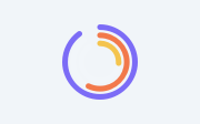
A painted donut / multi-ring radial chart.
Two modes: mode="rings" (default) - CONCENTRIC gauge rings, one per value: each value is its own ring at a decreasing radius, sweeping an arc proportional to value / max(values) over a faint track, with rounded caps. This is the "several rings" radial-bar look (outer = largest value). mode="segments" - a single ring split into coloured segments (a classic donut), rounded caps + gaps.
Painted directly with QPainter, so it stays crisp at ANY size (a QChart pie collapses to a hairline in constrained panels). Give values/colours via setData(...) in code, or the valuesCsv / colorsCsv properties in Qt Designer.
At a glance
| Tier | Free (GPLv3) |
| Import | from Custom_Widgets.QCustomDonut import QCustomDonut |
| Qt Designer | Yes — drag it from the palette |
Quick start
from Custom_Widgets.QCustomDonut import QCustomDonut

widget = QCustomDonut()
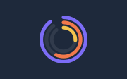
Dark theme
Colours come from the design tokens, so the widget follows the app theme with no extra work.
Properties
Every property below is settable in code and in Qt Designer.
| Property | Type | Default |
|---|---|---|
mode | enum: rings/segments`` | rings |
valuesCsv | string | 52,33,15 |
colorsCsv | string | #7c6cf6,#f2794b,#f4c44e |
holeRatio | float | 0.42 |
maxSweep | float | 324.0 |
gapDegrees | float | 4.0 |
trackColor | color | — |
gapColor | color | — |
showPercentLabels | bool | False |
percentLabelColor | color | #ffffff |
percentPill | bool | True |
percentPillColor | color | #12141c |
minLabelPercent | float | 4.0 |
hatchCsv | string | — |
hatchPattern | enum: bdiag/fdiag/cross/horizontal/vertical/dense`` | bdiag |
Methods
| Method | Description |
|---|---|
colorsCsv(*args, **kwargs) | Colors csv. |
gapColor(*args, **kwargs) | Gap color. |
gapDegrees(*args, **kwargs) | Gap degrees. |
hatchCsv(*args, **kwargs) | Hatch csv. |
hatchPattern(*args, **kwargs) | Hatch pattern. |
holeRatio(*args, **kwargs) | Hole ratio. |
maxSweep(*args, **kwargs) | Max sweep. |
minLabelPercent(*args, **kwargs) | Min label percent. |
mode(*args, **kwargs) | Mode. |
percentLabelColor(*args, **kwargs) | Percent label color. |
percentPill(*args, **kwargs) | Percent pill. |
percentPillColor(*args, **kwargs) | Percent pill color. |
setColors(colors) | Set the colors. |
setData(values, colors=None) | Set the data. |
setGapColor(color) | Set the gap color. |
setHatchIndices(indices) | Segment indices (segments mode) rendered with a hatch/pattern fill. |
setHatchPattern(name) | Set the hatch pattern. |
setMode(mode) | Set the mode. |
setShowPercentLabels(on) | Set the show percent labels. |
setTrackColor(color) | Set the track color. |
showPercentLabels(*args, **kwargs) | Show the percent labels. |
trackColor(*args, **kwargs) | Track color. |
values() | Values. |
valuesCsv(*args, **kwargs) | Values csv. |
Related
QCustomAreaChart · QCustomBarChart · QCustomBeeswarm · QCustomBubbleChart · QCustomCandlestickChart · QCustomCompass · QCustomCompassDial · QCustomDivergingBarChart