QCustomRadarChart
QCustomRadarChart ships in Custom Widgets Pro. It is not part of the free GPLv3 package from 2.6.0 onward — the free package keeps the import path so Qt Designer forms still load, and installing Pro activates the widget with no code change. Releases up to 2.5.0 included it under the GPLv3.
Pro is licensed software and is not installable from PyPI — the name there is a pointer package with no widgets in it. Licence holders download the wheel from their account:
# https://portal.customwidgets.org/downloads
pip install <the downloaded .whl>
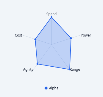
A painted radar / spider chart.
N axes radiating from a centre, one filled polygon per series. Used to compare several entities across the same set of measures - the shape of the polygon is the comparison, which no cartesian chart gives you.
This is the catalog's first polar chart of any kind. Rendered entirely with QPainter and NO QtCharts: Qt Charts is GPLv3-or-commercial with no LGPL option, so anything built on it cannot ship inside a proprietary wheel (see docs/design/mui-charts-gap.md). A test asserts the import graph stays clean.
Data goes in with setAxes([...]) + addSeries(name, values) in code, or the axesCsv / seriesCsv properties in Qt Designer, following the same convention as the other charts:
axesCsv = "Speed,Power,Range,Agility" seriesCsv = "Alpha=80,60,90,70;Beta=60,90,50,80"
Emits seriesHovered(int) and axisClicked(int); -1 means "nothing".
At a glance
| Tier | Pro |
| Import | from Custom_Widgets.QCustomRadarChart import QCustomRadarChart |
| Qt Designer | Yes — drag it from the palette |
Quick start
from Custom_Widgets.QCustomRadarChart import QCustomRadarChart

widget = QCustomRadarChart()
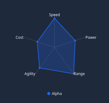
Dark theme
Colours come from the design tokens, so the widget follows the app theme with no extra work.
Properties
Every property below is settable in code and in Qt Designer.
| Property | Type | Default |
|---|---|---|
axesCsv | string | — |
seriesCsv | string | — |
seriesColorsCsv | string | — |
maxValue | float | 0.0 |
rings | int | 4 |
gridStyle | enum: polygon/circle`` | polygon |
startAngle | int | 90 |
fillOpacity | float | 0.25 |
lineWidth | float | 2.0 |
showAxisLabels | bool | True |
showRingLabels | bool | False |
showMarkers | bool | True |
showLegend | bool | True |
gridColor | color | #e2e8f0 |
axisColor | color | #64748b |
labelColor | color | #0f172a |
Signals
| Signal |
|---|
axisClicked(int) |
seriesHovered(int) |
Methods
| Method | Description |
|---|---|
addSeries(name, values, color=None) | Add a series. |
axes() | Axes. |
axesCsv(*args, **kwargs) | Axes csv. |
axisAt(pos) | Index of the nearest axis to a point, or -1 when outside the plot. |
axisClicked(...) | Axis clicked. |
axisColor(*args, **kwargs) | Axis color. |
axisCount() | Axis count. |
clearSeries() | Clear the series. |
fillOpacity(*args, **kwargs) | Fill opacity. |
gridColor(*args, **kwargs) | Grid color. |
gridStyle(*args, **kwargs) | Grid style. |
labelColor(*args, **kwargs) | Label color. |
lineWidth(*args, **kwargs) | Line width. |
maxValue(*args, **kwargs) | Max value. |
maximum() | The value the outermost ring represents. |
removeSeries(index) | Remove a series. |
rings(*args, **kwargs) | Rings. |
series() | Series. |
seriesAt(pos) | Index of the series whose polygon contains a point, or -1. |
seriesColor(index) | Series color. |
seriesColorsCsv(*args, **kwargs) | Series colors csv. |
seriesCount() | Series count. |
seriesCsv(*args, **kwargs) | Series csv. |
seriesHovered(...) | Series hovered. |
setAxes(labels) | Replace the axis labels. Existing series are re-fitted to the new |
setSeries(series) | Replace every series. Each item is (name, values). |
showAxisLabels(*args, **kwargs) | Show the axis labels. |
showLegend(*args, **kwargs) | Show the legend. |
showMarkers(*args, **kwargs) | Show the markers. |
showRingLabels(*args, **kwargs) | Show the ring labels. |
startAngle(*args, **kwargs) | Start the angle. |
Theming
Colours come from the design tokens, so they follow the active theme. Roles used: on-surface, on-surface-muted, surface-muted.
See Design tokens.
Related
QCustomAreaChart · QCustomBarChart · QCustomBeeswarm · QCustomBubbleChart · QCustomCandlestickChart · QCustomCompass · QCustomCompassDial · QCustomDivergingBarChart