QCustomCompassDial
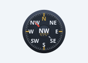
A PREMIUM beveled instrument compass.
The skeuomorphic-modern map compass (the Haulix "NW" dial): a beveled metal RIM (top-lit / bottom-shadowed gradient), a domed glass FACE (radial gradient), a fine watch-bezel TICK ring with brass majors at the cardinals, N/E/S/W (+ intercardinals), a slim two-tone needle and a metallic CENTRE CAP carrying the 16-point heading readout + degrees. All painted (gradients, not effects), so it recolours with the theme and stays crisp.
Sibling of the flat QCustomCompass — same API (heading 0-360, rotateBezel, animated shortest-path ease, drag-to-set, headingChanged) with the premium look. Text is measured to fit (never overflows / truncates).
At a glance
| Tier | Free (GPLv3) |
| Import | from Custom_Widgets.QCustomCompassDial import QCustomCompassDial |
| Qt Designer | Yes — drag it from the palette |
Quick start
from Custom_Widgets.QCustomCompassDial import QCustomCompassDial

widget = QCustomCompassDial()
Dark theme
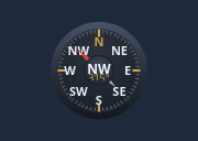
Colours come from the design tokens, so the widget follows the app theme with no extra work.
Properties
Every property below is settable in code and in Qt Designer.
| Property | Type | Default |
|---|---|---|
heading | float | 315.0 |
rotateBezel | bool | False |
showIntercardinals | bool | True |
showReadout | bool | True |
animated | bool | True |
interactive | bool | True |
bezelColor | color | #2a303c |
faceColor | color | #20262f |
accentColor | color | #c8a24a |
tickColor | color | #5b6472 |
cardinalColor | color | #e7ecf4 |
northColor | color | #e0463c |
southColor | color | #aeb6c2 |
capColor | color | #272e39 |
readoutColor | color | #f4f6fb |
Signals
| Signal |
|---|
headingChanged(double) |
Methods
| Method | Description |
|---|---|
accentColor(*args, **kwargs) | Accent color. |
animated(*args, **kwargs) | Animated. |
bezelColor(*args, **kwargs) | Bezel color. |
capColor(*args, **kwargs) | Cap color. |
cardinal16(deg) | Cardinal16. |
cardinalColor(*args, **kwargs) | Cardinal color. |
faceColor(*args, **kwargs) | Face color. |
heading(*args, **kwargs) | Heading. |
headingChanged(...) | Heading changed. |
interactive(*args, **kwargs) | Interactive. |
northColor(*args, **kwargs) | North color. |
readoutColor(*args, **kwargs) | Readout color. |
rotateBezel(*args, **kwargs) | Rotate bezel. |
setHeading(deg) | Set the heading. |
showIntercardinals(*args, **kwargs) | Show the intercardinals. |
showReadout(*args, **kwargs) | Show the readout. |
southColor(*args, **kwargs) | South color. |
tickColor(*args, **kwargs) | Tick color. |
Related
QCustomAreaChart · QCustomBarChart · QCustomBeeswarm · QCustomBubbleChart · QCustomCandlestickChart · QCustomCompass · QCustomDivergingBarChart · QCustomDonut