QCustomLiquidGauge
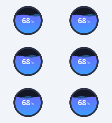
A wavy liquid-fill level gauge.
A circular (or rounded-rect) container with an animated sine-wave liquid fill whose height tracks the value - the classic fuel / battery / tank / storage / humidity disc. Two offset waves give the surface depth; a QTimer drifts them horizontally so the liquid ripples. The centre shows the value + a suffix (e.g. "3.61 gal", "72%") and an optional status chip below.
Painted with QPainter so it stays crisp at any size; the disc + centre text
FLEX to the box (reserving room for the chip) so nothing clips. Colours are
qproperties so they flip with the theme. Drive it with setValue(...); the fill
eases to the new level when animated.
At a glance
| Tier | Free (GPLv3) |
| Import | from Custom_Widgets.QCustomLiquidGauge import QCustomLiquidGauge |
| Qt Designer | Yes — drag it from the palette |
Quick start
from Custom_Widgets.QCustomLiquidGauge import QCustomLiquidGauge

widget = QCustomLiquidGauge()
Dark theme
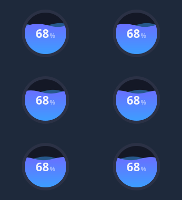
Colours come from the design tokens, so the widget follows the app theme with no extra work.
Properties
Every property below is settable in code and in Qt Designer.
| Property | Type | Default |
|---|---|---|
value | float | 68.0 |
minimum | float | 0.0 |
maximum | float | 100.0 |
shape | enum: circle/roundedRect`` | circle |
cornerRadius | int | 22 |
fillColor | color | #3aa0ff |
fillColor2 | color | #7c5cff |
backgroundColor | color | #141826 |
ringColor | color | #2b3145 |
ringWidth | int | 6 |
waveAmplitude | float | 0.0 |
waveLength | float | 0.0 |
waveSpeed | float | 0.06 |
animated | bool | True |
centerText | string | — |
centerSuffix | string | % |
centerTextColor | color | #f4f6fb |
badgeText | string | — |
badgeColor | color | — |
Signals
| Signal |
|---|
valueChanged(double) |
Methods
| Method | Description |
|---|---|
animated(*args, **kwargs) | Animated. |
backgroundColor(*args, **kwargs) | Background color. |
badgeColor(*args, **kwargs) | Badge color. |
badgeText(*args, **kwargs) | Badge text. |
centerSuffix(*args, **kwargs) | Center suffix. |
centerText(*args, **kwargs) | Center text. |
centerTextColor(*args, **kwargs) | Center text color. |
cornerRadius(*args, **kwargs) | Corner radius. |
fillColor(*args, **kwargs) | Fill color. |
fillColor2(*args, **kwargs) | Fill color2. |
maximum(*args, **kwargs) | Maximum. |
minimum(*args, **kwargs) | Minimum. |
ringColor(*args, **kwargs) | Ring color. |
ringWidth(*args, **kwargs) | Ring width. |
setAnimated(on) | Set the animated. |
setBadge(text, color=None) | Set the badge. |
setCenterText(text) | Set the center text. |
setColors(fill1, fill2=None, background=None) | Set the colors. |
setRange(minimum, maximum) | Set the range. |
setValue(value) | Set the value. |
shape(*args, **kwargs) | Shape. |
value(*args, **kwargs) | Value. |
valueChanged(...) | Value changed. |
waveAmplitude(*args, **kwargs) | Wave amplitude. |
waveLength(*args, **kwargs) | Wave length. |
waveSpeed(*args, **kwargs) | Wave speed. |
Related
QCustomAreaChart · QCustomBarChart · QCustomBeeswarm · QCustomBubbleChart · QCustomCandlestickChart · QCustomCompass · QCustomCompassDial · QCustomDivergingBarChart