QCustomRadialGauge
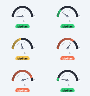
A modern painted gauge (the gauge FAMILY in one widget).
Two looks, switched with gaugeStyle:
gaugeStyle="needle" (default) - a thick coloured value arc over a muted
track + a drawn needle pointer, big centre value, min/max scale labels
at the arc ends and an optional coloured status badge below. Covers the
speedometer / threshold / "Threat Level" semicircle gauges. Colour the
value arc by ZONES (green/amber/red) so the arc + badge track the band
the value falls in, or by a two-stop gradient.
gaugeStyle="tick" - a sweep of tick marks: the passed ticks use a
gradient (e.g. pink->purple), the rest a muted track. Covers the
radial-tick timer ("17 Sec"). Drive it as a countdown with start()/stop().
Painted directly with QPainter so it stays crisp at ANY size and recolours on
a theme switch (all colours are qproperties). Give it a value in code via
setValue(...) / setRange(...) or the Designer properties; feed zones via
setZones([...]) or the zonesCsv property ("lo:hi:#hex, ...").
Angles use the Qt convention (degrees, 0 at 3 o'clock, positive = CCW), so a downward-opening semicircle is startAngle=180, spanAngle=-180 and a 270-deg timer with a gap at the bottom is startAngle=225, spanAngle=-270.
At a glance
| Tier | Free (GPLv3) |
| Import | from Custom_Widgets.QCustomRadialGauge import QCustomRadialGauge |
| Qt Designer | Yes — drag it from the palette |
Quick start
from Custom_Widgets.QCustomRadialGauge import QCustomRadialGauge

widget = QCustomRadialGauge()
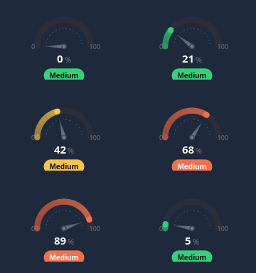
Dark theme
Colours come from the design tokens, so the widget follows the app theme with no extra work.
Properties
Every property below is settable in code and in Qt Designer.
| Property | Type | Default |
|---|---|---|
singleStep | float | — |
value | float | 55.0 |
minimum | float | 0.0 |
maximum | float | 100.0 |
gaugeStyle | enum: needle/tick`` | needle |
startAngle | float | 180.0 |
spanAngle | float | -180.0 |
tickCount | int | 44 |
arcWidth | int | 16 |
zonesCsv | string | 0:33:#33d17a,33:66:#f4c44e,66:100:#f2704e |
gradientStart | color | #7c5cff |
gradientEnd | color | #ff5c8a |
trackColor | color | #2a2e3a |
needleColor | color | #454b59 |
centerText | string | — |
centerSuffix | string | % |
statusText | string | Medium |
statusColor | color | — |
centerTextColor | color | #f4f6fb |
scaleColor | color | #6b7280 |
showTicks | bool | False |
showHandle | bool | False |
handleColor | color | #ffffff |
centerIcon | string | — |
iconColor | color | — |
innerColor | color | — |
showNeedle | bool | True |
showScaleLabels | bool | True |
showGuide | bool | True |
scaleLabelEvery | float | 0.0 |
emphasizeActiveTick | bool | True |
activeTickExtend | enum: inward/outward/both`` | inward |
scaleLabelRadius | float | 0.0 |
roundedCaps | bool | True |
animated | bool | False |
animationDuration | int | 600 |
glow | bool | False |
glowStrength | float | 0.6 |
glowRadius | int | 0 |
Signals
| Signal |
|---|
finished() |
valueChanged(double) |
Methods
| Method | Description |
|---|---|
activeTickExtend(*args, **kwargs) | Active tick extend. |
animated(*args, **kwargs) | Animated. |
animationDuration(*args, **kwargs) | Animation duration. |
arcWidth(*args, **kwargs) | Arc width. |
centerIcon(*args, **kwargs) | Center icon. |
centerSuffix(*args, **kwargs) | Center suffix. |
centerText(*args, **kwargs) | Center text. |
centerTextColor(*args, **kwargs) | Center text color. |
emphasizeActiveTick(*args, **kwargs) | Emphasize active tick. |
finished(...) | Finished. |
gaugeStyle(*args, **kwargs) | Gauge style. |
glow(*args, **kwargs) | Glow. |
glowRadius(*args, **kwargs) | Glow radius. |
glowStrength(*args, **kwargs) | Glow strength. |
gradientEnd(*args, **kwargs) | Gradient end. |
gradientStart(*args, **kwargs) | Gradient start. |
handleColor(*args, **kwargs) | Handle color. |
iconColor(*args, **kwargs) | Icon color. |
innerColor(*args, **kwargs) | Inner color. |
maximum(*args, **kwargs) | Maximum. |
minimum(*args, **kwargs) | Minimum. |
needleColor(*args, **kwargs) | Needle color. |
roundedCaps(*args, **kwargs) | Rounded caps. |
scaleColor(*args, **kwargs) | Scale color. |
scaleLabelEvery(*args, **kwargs) | Scale label every. |
scaleLabelRadius(*args, **kwargs) | Scale label radius. |
setCenterText(text) | Set the center text. |
setGradient(start, end) | Set the gradient. |
setRange(minimum, maximum) | Set the range. |
setStatusText(text) | Set the status text. |
setStyle(gaugeStyle) | Switch between the 'needle' and 'tick' looks. |
setValue(value) | Set the value. |
setZones(zones) | zones: iterable of (lo, hi, colour) in value units (colours the arc). |
showGuide(*args, **kwargs) | Show the guide. |
showHandle(*args, **kwargs) | Show the handle. |
showNeedle(*args, **kwargs) | Show the needle. |
showScaleLabels(*args, **kwargs) | Show the scale labels. |
showTicks(*args, **kwargs) | Show the ticks. |
singleStep(*args, **kwargs) | Single step. |
spanAngle(*args, **kwargs) | Span angle. |
start(seconds=None, interval_ms=1000, step=1.0) | Count the value down to the minimum, emitting finished() at the end. |
startAngle(*args, **kwargs) | Start the angle. |
statusColor(*args, **kwargs) | Status color. |
statusText(*args, **kwargs) | Status text. |
stepBy(delta) | Nudge the value by delta (clamped to the range). With centerText |
stepDown() | Step down. |
stepUp() | Step up. |
stop() | Stop. |
tickCount(*args, **kwargs) | Tick count. |
trackColor(*args, **kwargs) | Track color. |
value(*args, **kwargs) | Value. |
valueChanged(...) | Value changed. |
zonesCsv(*args, **kwargs) | Zones csv. |
Related
QCustomAreaChart · QCustomBarChart · QCustomBeeswarm · QCustomBubbleChart · QCustomCandlestickChart · QCustomCompass · QCustomCompassDial · QCustomDivergingBarChart