QCustomRangeBarChart
QCustomRangeBarChart ships in Custom Widgets Pro. It is not part of the free GPLv3 package from 2.6.0 onward — the free package keeps the import path so Qt Designer forms still load, and installing Pro activates the widget with no code change. Releases up to 2.5.0 included it under the GPLv3.
Pro is licensed software and is not installable from PyPI — the name there is a pointer package with no widgets in it. Licence holders download the wheel from their account:
# https://portal.customwidgets.org/downloads
pip install <the downloaded .whl>
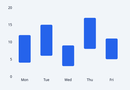
A painted floating-bar / range chart.
Each bar spans a low-to-high pair rather than sitting on a baseline: a temperature min/max, a salary band, a project window, a confidence interval. A normal bar chart cannot express "from X to Y".
QPainter only, NO QtCharts (see docs/design/mui-charts-gap.md). Axis ticks come from the shared _chart_axis so this agrees with Scatter about where round numbers fall.
Data goes in with setRanges([...]) in code, or rangesCsv in Qt Designer:
rangesCsv = "Mon=4,12;Tue=6,15;Wed=3,9" categoriesCsv overrides the labels if you prefer them separate
Emits barHovered(int) and barClicked(int); -1 means "nothing".
At a glance
| Tier | Pro |
| Import | from Custom_Widgets.QCustomRangeBarChart import QCustomRangeBarChart |
| Qt Designer | Yes — drag it from the palette |
Quick start
from Custom_Widgets.QCustomRangeBarChart import QCustomRangeBarChart

widget = QCustomRangeBarChart()
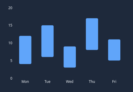
Dark theme
Colours come from the design tokens, so the widget follows the app theme with no extra work.
Properties
Every property below is settable in code and in Qt Designer.
| Property | Type | Default |
|---|---|---|
rangesCsv | string | — |
categoriesCsv | string | — |
orientation | enum: vertical/horizontal`` | vertical |
barWidthRatio | float | 0.55 |
cornerRadius | int | 4 |
tickCount | int | 5 |
showGrid | bool | True |
showAxis | bool | True |
showLabels | bool | True |
showBounds | bool | False |
barColor | color | #2563eb |
gridColor | color | #e2e8f0 |
labelColor | color | #64748b |
boundsColor | color | #0f172a |
Signals
| Signal |
|---|
barClicked(int) |
barHovered(int) |
Methods
| Method | Description |
|---|---|
barAt(pos) | Bar at. |
barClicked(...) | Bar clicked. |
barColor(*args, **kwargs) | Bar color. |
barCount() | Bar count. |
barHovered(...) | Bar hovered. |
barRects() | Bar rects. |
barWidthRatio(*args, **kwargs) | Bar width ratio. |
boundsColor(*args, **kwargs) | Bounds color. |
categoriesCsv(*args, **kwargs) | Categories csv. |
clearRanges() | Clear the ranges. |
cornerRadius(*args, **kwargs) | Corner radius. |
dataBounds() | Data bounds. |
gridColor(*args, **kwargs) | Grid color. |
labelColor(*args, **kwargs) | Label color. |
orientation(*args, **kwargs) | Orientation. |
ranges() | Ranges. |
rangesCsv(*args, **kwargs) | Ranges csv. |
setRanges(ranges) | Set the ranges. |
showAxis(*args, **kwargs) | Show the axis. |
showBounds(*args, **kwargs) | Show the bounds. |
showGrid(*args, **kwargs) | Show the grid. |
showLabels(*args, **kwargs) | Show the labels. |
tickCount(*args, **kwargs) | Tick count. |
valueRange() | Value range. |
valueToPixel(value) | Value -> pixel along the value axis. |
Theming
Colours come from the design tokens, so they follow the active theme. Roles used: accent, on-surface, surface-muted.
See Design tokens.
Related
QCustomAreaChart · QCustomBarChart · QCustomBeeswarm · QCustomBubbleChart · QCustomCandlestickChart · QCustomCompass · QCustomCompassDial · QCustomDivergingBarChart