QCustomAgendaList
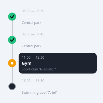
A schedule / event timeline list.
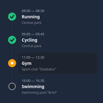
The day-plan card (Running / Cycling / Gym / Swimming): each row has a left CONNECTOR RAIL with a per-item status marker, a time range, a bold title and a muted subtitle (location). Status is done / active / pending (colour + painted marker: a check, a filled dot, a hollow ring - no glyph fonts). The active row gets a highlighted rounded background.
Feed rows with setItems([{time, endTime, title, subtitle, status, color}]) or
the itemsJson Designer property. Painted with QPainter; rows FLEX to a row
height that fits the text, so it sits happily inside a QScrollArea. Colours are
qproperties so they flip with the theme. Signal: itemClicked(index).
At a glance
| Tier | Free (GPLv3) |
| Import | from Custom_Widgets.QCustomAgendaList import QCustomAgendaList |
| Qt Designer | Yes — drag it from the palette |
Quick start
from Custom_Widgets.QCustomAgendaList import QCustomAgendaList

widget = QCustomAgendaList()
Dark theme
Colours come from the design tokens, so the widget follows the app theme with no extra work.
Properties
Every property below is settable in code and in Qt Designer.
| Property | Type | Default |
|---|---|---|
itemsJson | string | — |
rowHeight | int | 0 |
railColor | color | #2b3040 |
doneColor | color | #22c07e |
activeColor | color | #f59e0b |
pendingColor | color | #8b90a0 |
titleColor | color | #f4f6fb |
subtitleColor | color | #8b90a0 |
timeColor | color | #aab2bd |
activeBgColor | color | #1e2330 |
showRail | bool | True |
Signals
| Signal |
|---|
itemClicked(int) |
Methods
| Method | Description |
|---|---|
activeBgColor(*args, **kwargs) | Active bg color. |
activeColor(*args, **kwargs) | Active color. |
doneColor(*args, **kwargs) | Done color. |
heightForWidth(w) | Height for width. |
itemClicked(...) | Item clicked. |
items() | Items. |
itemsJson(*args, **kwargs) | Items json. |
pendingColor(*args, **kwargs) | Pending color. |
railColor(*args, **kwargs) | Rail color. |
rowHeight(*args, **kwargs) | Row height. |
setItems(items) | Set the items. |
showRail(*args, **kwargs) | Show the rail. |
subtitleColor(*args, **kwargs) | Subtitle color. |
timeColor(*args, **kwargs) | Time color. |
titleColor(*args, **kwargs) | Title color. |
Related
QCustomAlert · QCustomAvatar · QCustomAvatarGroup · QCustomBadge · QCustomCard · QCustomChip · QCustomChipGroup · QCustomClockLabel