QCustomLinkPreview
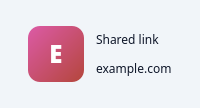
A shared-link preview card.
The row seen under the "Links" tab: a rounded thumbnail (a real favicon / image via setThumbnail, or a painted gradient with the site initial as a fallback), the link title (bold, elided), the domain (muted) and an optional one-line description. Feed it with setLink(title, url, description=None, thumbnail=None) or the Designer qproperties. Clicking emits clicked(url). The card panel + text colours are driven from the app QSS (objectName selectors) so they flip with the theme.
At a glance
| Tier | Free (GPLv3) |
| Import | from Custom_Widgets.QCustomLinkPreview import QCustomLinkPreview |
| Qt Designer | Yes — drag it from the palette |
Quick start
from Custom_Widgets.QCustomLinkPreview import QCustomLinkPreview

widget = QCustomLinkPreview()
Dark theme
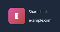
Colours come from the design tokens, so the widget follows the app theme with no extra work.
Properties
Every property below is settable in code and in Qt Designer.
| Property | Type | Default |
|---|---|---|
title | string | Shared link |
url | string | example.com |
description | string | — |
Signals
| Signal |
|---|
clicked(QString) |
Methods
| Method | Description |
|---|---|
clicked(...) | Clicked. |
description(*args, **kwargs) | Description. |
setLink(title, url, description=None, thumbnail=None) | Set the link. |
setThumbnail(pm) | Set the thumbnail. |
title(*args, **kwargs) | Title. |
url(*args, **kwargs) | Url. |
Related
QCustomAgendaList · QCustomAlert · QCustomAvatar · QCustomAvatarGroup · QCustomBadge · QCustomCard · QCustomChip · QCustomChipGroup